The Art of Doubling to the Pitcher

Over at the Community Research section of FanGraphs, I took a look at the only two times this season a player has hit a double to the pitcher. It’s a pretty rare feat and the way in which both doubles happened were very different. It’s a fun read with plenty of screenshots. Hope you enjoy!
Joe Blanton Defies The Odds

Over in the Community Research section of FanGraphs, I have a post exploring Joe Blanton’s extremely high HR rate, it’s place in history, and what might be causing it. If you’re interesting in pitching and statistical outliers, this might be for you. Take a look over at FanGraphs.
I’m always up to tackle difficult baseball questions, so if you’ve got a Tigers player you want to see broken down or really anything else in baseball, let me know on Twitter @NeilWeinberg44 or at NewEnglishD@gmail.com
Craig Biggio: Double Play Escape Artist
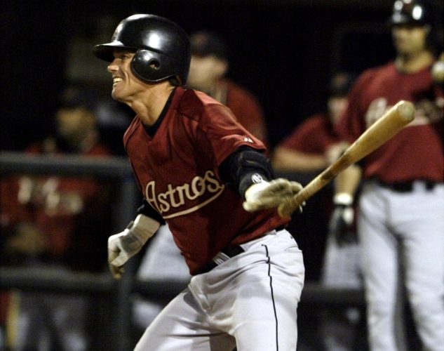
I recently wrote a piece over in the Community Research section at Fangraphs paying tribute to Craig Biggio’s amazing 1997 season. Not only did he lead the league in WAR, but he did so with one of the most balanced and complete seasons in recent memory. More interestingly, in my opinion, is that Biggio went the whole season without grounding into a single double play. In 78 chances, he hit into exactly 0 double plays. Only 7 qualifying MLB since 1939 (as far back as the data goes) have ever finished a season with zero GIDP and three did so in a strike shortened campaign.
Stat of the Week: Weighted Runs Created Plus (wRC+)

After a break during the offseason, our Stat of the Week series returns today with an important offensive metric know as Weighted Runs Created Plus (wRC+). You can find this metric on Fangraphs with a full explanation here.
Last season I broke down wOBA which is OPS on steroids. The wOBA idea feeds into wRC. What wRC+ tells is how much better a player is than average when it comes to producing runs for his team. Simpler yet, it’s a catch all offensive metric that can be used for easy comparison between players.
Like WAR, this isn’t a perfect tool, but through some calculations based on the historical value of each plate appearance outcome, we can get an estimate of how much value a player brings to his team. League average wRC+ is scaled to 100, meaning that a player with a wRC+ of 120 is 20% better than a league average hitter. wRC+ is also adjusted for park and league effects, so if you play at Petco Park, you get a little boost because the park suppresses offense.
For reference, both Miguel Cabrera and Mike Trout posted wRC+ of 166 in 2012. The most average players in 2012 by wRC+ were Brett Lawrie and Rickie Weeks. Let’s look at Lawrie’s line to illustrate. He hit .273/.324/.405 with 11 HR in 536 PA. That looks about right for league average. wRC+ tells us Cabrera was 66% better than that, which makes sense given a .330/.393/.606 line.
You’ll need a big enough sample for wRC+ to tell you anything meaningful in a predictive sense, but as the season wears on take a look at the wRC+ leaderboard to get a sense of who the best offensive contributors are.
I encourage you to go back and read my wOBA breakdown because it stresses the idea that OBP and SLG are improperly weighted when you add them together to get OPS because a double isn’t really worth twice as much as a single. wOBA gives you a better answer to the question OPS tries to answer, and wRC+ scales it to league and park averages.
Go explore wRC+ for yourself and feel free to post any questions you may have. We at New English D are big believers in sabermetrics, not because we want to boil the game down to a spreadsheet, but because we always want more information about the game. More stats and metrics are a great way to learn more about the game and evaluate what you watch.
Skeptical? Here are the best 8 players by wRC+ last season: Cabrera, Trout, Braun, Posey, McCutchen, Fielder, Encarnacion, and Cano. The math might scare you off, but don’t let it. Just learn how to read the output. You don’t have to buy into everything you see on a sabermetric site, but I think that if you try it, you’ll like it. There is a ton you miss by staying with the traditional stats. And who wants to miss baseball?
Calculate it yourself!
Fangraphs and Baseball Reference Unify Replacement Level
Today, Fangraphs and Baseball Reference consummated a relationship we knew to be coming for the last few weeks. While the two sites have always calculated Wins Above Replacement (WAR) differently, they decided to discuss reworking a component of the metric. That component was replacement level, defined as the production of a player who is readily available as a minor league free agent or on the waiver wire.
Today it happened. Dave Cameron can give you all the specifics over at Fangraphs, and I can’t say I disagree with any of the changes. I like that the two leading sites are working to improve WAR and our overall statistical evaluation of baseball. This is a step in the right direction and it’s good for everyone involved.
But there is a weird result from today’s unveiling of the new replacement level that is freaking me the hell out.
Everyone’s WAR is slightly different than it was yesterday.
Now many who hate sabermetrics might use this as a point of assault, but those people who know better know that it’s just a shifting baseline calculation that marginally changes the precise point value of WAR. The substantive results are the same, just refined.
But for someone who reviews baseball statistics quite religiously, it’s trippy. For example, Justin Verlander gained 0.2 WAR for 2012. Buster Posey lost 0.4 WAR. Most of the exact changes are pretty small and don’t change the interpretation much, but when we’re dealing with something like WAR that is imprecise and on a relatively small scale, things get funky. A bunch of players shifted places in rankings. Not dramatically, mind you, just from 2nd to 3rd or 8th to 7th. It’s minor and doesn’t mean much, it’s just weird.
I woke up today and the past had changed. I mean, I know that isn’t true, but it seems like it. Justin Verlander was the best pitcher by WAR last season, but now he is the best by more. Perhaps this means nothing to anyone else, but it was interesting for me.
WAR got better today and given the people in charge of its design, it will continue to get better into the future. Let’s just hope I’m better prepared to cope next time and don’t spend an hour of my day staring at my computer repeating “this is weird” to myself.
But seriously, it was.
