Wins Above Replacement (WAR) Calculator

One of the missions of New English D is to make sabermetrics more easily digestible. To that end, we have an extensive Stat Primer series that explains a lot of important concepts and stats. One of the most controversial, but important stats out there is Wins Above Replacement (WAR). I wrote about WAR over a year ago here, so feel free to read that as a primer for what WAR is trying to measure. I also apologize if it’s not perfectly written, as it was one of the first pieces I put out there and was still working to develop some expert internet-writing skills.
Calculate FIP, xFIP, and wOBA too!
That said, people often complain that WAR is really too complicated and it doesn’t make sense to them. Well, I’m going to give you the tools to calculate WAR right here and right now. I will make two quick points.
- This is an approximation of the FanGraphs version of WAR for position players, not pitchers.
- This is not perfect, mostly in the sense that it does not account for park factors. If your fake player plays in a hitter friendly park, this number will be too high. If they play in a pitcher friendly park, it will be too low. Not a huge amount, but some. This calculator isn’t perfect because in order for it to be perfect, I would have to ask you to input way more information and I would have to learn how to be a much better coder.
- This doesn’t account for league, which makes a small difference and it doesn’t break down by number of games played at different positions if your player plays more than one.
Here is how it works. Fill in the data from Cell B2 to Cell B11 with the basic statistics of your player. In Cell B17, type the number that corresponds with their position in the “H” column. In Cell B18, type the number of runs above or below average you player is on defense. A perfectly average defender at the position in question will be zero. Remember these are run values and generally range from -10 to +10. Do the same thing with baserunning runs in Cell B19. If you want more information on any of these numbers, visit our Stat Primer page for details.
If you’ve done everything correctly, you should have a WAR value in B20. Remember, this doesn’t adjust for park or league, so it won’t be perfect, but it should give you a pretty nice idea if you’re just looking to play around with some numbers. Essentially, this is a “what if WAR machine.”
Right now, these numbers reflect the 2013 regular season. Feel free to play around with the numbers in the blue box if you wish to calculate based on different seasons. All of the numbers can be found on this FG page with the exception of Lg R and Lg PA, which are simply the total number of runs and plate appearances in the league that season.
Enjoy and feel free to post if you catch any mistakes. This one was much harder to write than FIP, xFIP, and wOBA.
Could We Assign “Wins” Differently?
If you’ve been here before, or someone like Brian Kenny tweeted a link to this post, you know that we are big proponents of the #KillTheWin movement. We don’t like wins and losses as a pitching statistic for many reasons. You can pitch well and not get a win, you can pitch terribly and get a win, wins don’t even out, and wins are extremely misleading. Put simply, wins are dependent on things that pitchers can’t control and it’s silly to measure them based on something their teammates do. Here are links to all of our formative #KillTheWin work:
- You Can Pitch Great and Not Win
- You Can Pitch Poorly and Win
- Wins Don’t Even Out Over Long Careers
- Wins Mislead You When Comparing Players
- Assorted Facts About Wins from 2013
- Dissecting the Case in Support of Wins
But today I’d like to address a solution that a lot of people are calling for. You see, the old guard won’t let go of the wins and losses concept and language. They can’t accept things like FIP, xFIP, and WAR, or even K%, BB%, GB%. Even ERA is doesn’t satisfy their longing for the “W.” So I’d like to propose a simple idea that simply changes the methodology for awarding wins and losses. Currently, a starter has to pitch at least 5 innings, leave with a lead, and not watch the bullpen surrender that lead. If we invented wins and losses today, no doubt we wouldn’t use such a silly rule.
So let’s use a better one. If there is an appetite for Wins and Losses, why don’t we actually tie wins and losses to performance? Here are two basic proposals that do that while solving a couple of key issues with wins.
The first problem with wins and losses is that it depends on how much and when your team scores. So what we want is something that only measures the impact of the pitcher on the game. Another problem with wins and losses is that the no-decision essentially erases everything you did on a given day. If a pitcher throws 7 shutout innings and gets a no decision, that game shows up in every single one of his stats except wins and losses. We want to judge every start a pitcher makes, not just one in which the right conditions are met by his offense and bullpen.
To partially resolve this issue, let’s turn to the 2013 Tigers as an example. Instead of wins and losses as determined by the current rule, what if we allocate them by Win Probability Added (WPA) or Run Expectancy 24 (RE24)? Those two stats are a bit complicated to calculate, but extremely easy to understand. WPA reflects the percentage by which a player improved his team’s chances of winning. It is very context dependent, but you can still earn positive values even when your team is losing. RE24 is a similar statistic except it doesn’t pay attention to the score of the game and just reflects how many runs above or below average you are contributing. Think of it this way, in a 10-0 game a solo homerun has a pretty low WPA because the game is already decided, but it has the same RE24 in a 10-0 as it does in a 2-0 game. Both allow for the addition of value in a context dependent sense, but both also allow a player to add value even when his team is not. Both of these stats are readily available on FanGraphs and Baseball-Reference.
Below I present the 2013 Tigers with WPA and RE24 “wins.” If a pitcher has a positive WPA or RE24 for a single game they get a win. If it’s negative, they get a loss. No no-decisions and no concern about how the game actually ended. Did the pitcher improve his team’s chances of winning a single game? That’s what wins and losses should tell us, so let’s try this.
There are obvious weakness to this approach, namely that I’m not addressing by how much a pitcher helped his team, but to answer that question, we have season long numbers that are more important. This approach is meant to give people who want to see wins and losses a better reflection of true value.
| Pitcher | Starts | W-L | WPA W-L | RE24 W-L |
| Fister | 28 | 12-7 | 18-10 | 19-9 |
| Sanchez | 24 | 12-7 | 16-8 | 17-7 |
| Scherzer | 27 | 19-1 | 22-5 | 22-5 |
| Verlander | 29 | 12-10 | 17-12 | 18-11 |
| Porcello | 26 | 11-7 | 15-11 | 16-10 |
You will notice a couple of things. You’ll notice that Scherzer’s no-decisions are primarily the function of his team bailing him out and Fister, Sanchez, and Verlander’s are almost all a case of the Tigers not providing enough run support. Porcello’s are divided pretty evenly. This is interesting because it shows that even on individual teams, wins/losses/no decisions are handed out irregularly despite the same contingent of position players.
For the die-hard #KillTheWin-er, this approach is still too context dependent and derived from an illogical attempt to hand wins and losses to a single player. But for a more traditional observer, hopefully this is compelling. Even if you like wins and losses, surely you can appreciate that the actual way in which wins and losses are assigned is arbitrary and foolish. Why is 5 innings the cutoff? Why do you not get a win if you pitch 8 shutout innings and your team wins in a walkoff? Why should you get a win if you allow 6 runs? Even if you want to track day to day contribution, at least track it in a way that reflects what the player you’re judging actually did.
Now I’m not sure if this is the best way, but this is definitely an improvement over wins and losses as currently defined. The current stat makes no contribution to analysis, this one makes some contribution. I’d still rather pay attention to season long numbers, but if we’re going to judge a player in each individual game, let’s at least do it right.
Reader Question: Cashing in Multiple Runners
I love finding answers and solving problems, which makes writing about baseball so rewarding. There are many questions and tons of information, and occasionally a reader sends in a question they’ve been wondering about but haven’t had the time or ability to figure out. This post seek to answer one of those questions, and I hope it encourages more. Last week, at a reader’s request I examined Torii Hunter’s defense. Today, I’m looking into a more complicated question.
So I’ll set the stage. Reader Dennis asked if there was anything to a team being able to driving in multiple runners with singles, doubles, and triples. His claim was that it seemed like the Tigers seemed to only score one run at a time (except on HR) early in the 2012 and he was wondering if there was anything to a team being able (or unable) to get hits that scored multiple runners.
Dennis rightly recognizes that this is a context dependent statistic like RBI, but his question centers around a team’s ability to score runs rather than judging an individual player based on his role in the run scoring process. I wasn’t really sure what I would find, but someone asked a question nicely and I couldn’t resist.
Let’s start with a simple calculation. Let’s just look at the team’s batting average on balls in play (BABIP) from 2012 with men on base and overall. This will tell us how often a team gets a single, double, or triple when they make contact with a ball that doesn’t go over the fence. In the first column is the team’s BABIP with men on base and the second column is the team’s total BABIP. The third column is how much worse they are with men on base.
| Team | mBABIP | tBABIP | DIFF |
| Braves | 0.285 | 0.296 | -0.011 |
| Yankees | 0.284 | 0.293 | -0.009 |
| Marlins | 0.281 | 0.289 | -0.008 |
| Cardinals | 0.31 | 0.316 | -0.006 |
| Blue Jays | 0.276 | 0.281 | -0.005 |
| Padres | 0.293 | 0.297 | -0.004 |
| Mets | 0.295 | 0.298 | -0.003 |
| Astros | 0.286 | 0.288 | -0.002 |
| Brewers | 0.297 | 0.299 | -0.002 |
| Giants | 0.313 | 0.315 | -0.002 |
| Reds | 0.294 | 0.296 | -0.002 |
| Red Sox | 0.3 | 0.301 | -0.001 |
| Twins | 0.297 | 0.298 | -0.001 |
| Angels | 0.311 | 0.311 | 0.000 |
| Dodgers | 0.298 | 0.298 | 0.000 |
| Cubs | 0.287 | 0.286 | 0.001 |
| Indians | 0.289 | 0.288 | 0.001 |
| Pirates | 0.294 | 0.291 | 0.003 |
| Rangers | 0.309 | 0.306 | 0.003 |
| Diamondbacks | 0.312 | 0.307 | 0.005 |
| Nationals | 0.314 | 0.308 | 0.006 |
| Orioles | 0.294 | 0.286 | 0.008 |
| Rockies | 0.329 | 0.321 | 0.008 |
| Tigers | 0.315 | 0.307 | 0.008 |
| Rays | 0.294 | 0.284 | 0.010 |
| White Sox | 0.3 | 0.289 | 0.011 |
| Mariners | 0.29 | 0.276 | 0.014 |
| Phillies | 0.304 | 0.29 | 0.014 |
| Royals | 0.316 | 0.302 | 0.014 |
| Athletics | 0.296 | 0.281 | 0.015 |
Interestingly enough, you’ll notice the Tigers actually got more hits on balls in play with men on base than they did overall, and therefore with no one on. Generally, you would expect a team to have a higher BABIP when men are on base because the first basemen is often out of position and the pitcher is in the stretch. But you can see with the chart that it’s actually pretty even between teams that are better or worse. There are a lot of factors involved in this that I’m not controlling for, but this is just a jumping off point. From here on out I’m going to use a case study approach because using data from all 30 teams would be very time consuming and quite difficult to present clearly. I’m going to take the 2012 Tigers and the 2012 Angels (who scored more runs in a more pitcher-friendly park) and compare how they scored their runs with respect to Dennis’ question.
Let’s start with some basic stats to get you started:
| Team | R | HR | BB% | K% | BABIP | AVG | OBP | SLG | wOBA | wRC+ |
| Angels | 767 | 187 | 7.3% | 18.2% | 0.311 | 0.274 | 0.332 | 0.433 | 0.331 | 113 |
| Tigers | 726 | 163 | 8.4% | 18.0% | 0.307 | 0.268 | 0.335 | 0.422 | 0.328 | 105 |
First you’ll notice that the Angels scored 41 more runs than the Tigers, mostly by out-slugging them and hitting more homeruns. If you correct for their ballpark advantage Angels were a better offensive club using wRC+ (what’s wRC+?) which is a statistic that measures a team compared to league average. The Angels were 8% better and the Tigers were 5% better than average correcting for park effects.
I’m using this example because the Angels outscored the Tigers and did so in a tougher park. Generally, they should have a harder time scoring runs but they scored more. Is it possible they were better at driving in multiple runs at a time or were they just better overall. That’s the question I’m looking to answer here, per Dennis’ question. Let’s just grab some quick numbers with men on base to get us going:
| Team | OBP | SLG | wOBA | wRC+ |
| Tigers | 0.349 | 0.425 | 0.332 | 107 |
| Angels | 0.335 | 0.432 | 0.329 | 111 |
Let me call you attention to this very important set of numbers. The Tigers and Angels derived similar unadjusted offensive production using wOBA (what’s wOBA?) and the Angels get a bump from their park in wRC+. But what is interesting is that the Tigers are getting more value from getting on base and the Angels are doing it with slugging. Let’s really dig deeper now.
The Tigers had 6,119 plate appearances in 2012. Of which, 912 came with more than one man on base. The Tigers had 912 opportunities to drive in multiple runs without hitting a homerun (Angels had 6,121 and 832). The question Dennis asks is how often did they do it?
Let’s break it down by outs, because it’s only fair to consider that the out profile is very important. Here the the raw numbers for the Tigers reflecting times when there were at least two men on base:
| Outs | PA | HR | Hit 1 RBI | Hit 2+ RBI | Non Hit RBI | 0 RBI Reached | 0 RBI Out |
| 0 | 171 | 5 | 22 | 7 | 14 | 20 | 103 |
| 1 | 350 | 7 | 58 | 21 | 47 | 39 | 178 |
| 2 | 391 | 7 | 47 | 26 | 4 | 52 | 255 |
And now here are the numbers for the Angels:
| Outs | PA | HR | Hit 1 RBI | Hit 2+ RBI | Non Hit RBI | 0 RBI Reached | 0 RBI Out |
| 0 | 157 | 7 | 20 | 5 | 24 | 17 | 84 |
| 1 | 299 | 9 | 51 | 19 | 39 | 26 | 155 |
| 2 | 376 | 4 | 45 | 29 | 6 | 46 | 246 |
The teams had the same number of total trips to the plate, but the Tigers had two or more men on base during 80 additional plate appearances. Let’s break this down by percentage for better comparison. What you see below is the raw number divided by PA with 0/1/2 outs. First the Tigers, then the Angels:
| Outs | PA | HR | Hit 1 RBI | Hit 2+ RBI | Non Hit RBI | 0 RBI Reached | 0 RBI Out |
| 0 | 171 | 2.92% | 12.87% | 4.09% | 8.19% | 11.70% | 60.23% |
| 1 | 350 | 2.00% | 16.57% | 6.00% | 13.43% | 11.14% | 50.86% |
| 2 | 391 | 1.79% | 12.02% | 6.65% | 1.02% | 13.30% | 65.22% |
| Outs | PA | HR | Hit 1 RBI | Hit 2+ RBI | Non Hit RBI | 0 RBI Reached | 0 RBI Out |
| 0 | 157 | 4.46% | 12.74% | 3.18% | 15.29% | 10.83% | 53.50% |
| 1 | 299 | 3.01% | 17.06% | 6.35% | 13.04% | 8.70% | 51.84% |
| 2 | 376 | 1.06% | 11.97% | 7.71% | 1.60% | 12.23% | 65.43% |
So what does this tell us? Are the Tigers bad at cashing multiple runs without a homerun? It turns out that Dennis’ perception was incorrect, at least when applied to the entire season. His comment was actually about the beginning of the season and he put it in context of the whole league and not the Angels, but presenting this data for all 30 teams would have been really hard to swallow. I picked the Angels because they scored more runs than the Tigers in a tougher park. Their offense was more successful than the Tigers, so I wanted to see if they were cashing in more effectively.
In reality, it’s just the opposite. The Angels hit more homeruns with two or more men on base than the Tigers and they drove in runs one at a time more often especially if you look in the Non-Hit RBI column. So I’ll apologize to Dennis for doing a case study instead of checking in on the entire league, but that would have just been too difficult to communicate to the readership. I worry this is already too much information.
What I find very interesting is that the Angels scored 375 of their 767 runs in these situations and the Tigers scored 374 of their 726 runs in these situations. The Tigers scored a higher percentage of their runs with multiple men on base than the Angels did despite hitting fewer homeruns.
So you can interpret this how you want to, but my guess is that Dennis was responding to a difference in baserunning ability. The Angels were about 3 wins above replacement better than the Tigers in the baserunning department in 2012 which can easily be the difference between scoring from second on singles and first on doubles on a number of occasions.
The lesson, I think, is that our perceptions are often clouded by flashpoint data. There was probably a stretch in early 2012 when the Tigers couldn’t get a hit with men on base to save their lives and that’s what Dennis remembered, but in reality, that was just part of the normal variation and the Tigers weren’t any worse than other teams in this department.
For a quick summary, the Tigers had 912 PA with two or more men on base. Let’s see how they did in each:
| PA | R | AB | 1B | 2B | 3B | HR | RBI | BB | IBB | SO |
| 912 | 374 | 782 | 157 | 49 | 3 | 19 | 361 | 76 | 15 | 155 |
| HBP | SH | SF | ROE | GDP | BA | OBP | SLG | OPS | BAbip |
| 10 | 9 | 35 | 8 | 71 | 0.292 | 0.348 | 0.435 | 0.783 | 0.325 |
And now the 832 PA for the Angels:
| PA | R | AB | 1B | 2B | 3B | HR | RBI | BB | IBB | SO |
| 832 | 375 | 711 | 146 | 37 | 3 | 20 | 356 | 63 | 11 | 149 |
| HBP | SH | SF | ROE | GDP | BA | OBP | SLG | OPS | BAbip |
| 6 | 17 | 34 | 14 | 47 | 0.29 | 0.338 | 0.435 | 0.772 | 0.323 |
The Tigers did pretty well getting hits in these situations and scoring in the way Dennis asked about and probably would have been better off driving in a few more runners with sacrifice flies. In fact you’ll notice that despite being in fewer of these situations, the Angels hit more HR and just one fewer sac fly. The Tigers cashed in with hits in play while the Angels were homering and hitting sac flies, which might be good evidence that scoring runs is scoring runs no matter how you do it. It was an interesting question and fun to look into. If you’re got questions like this, send them my way and I’ll try to fit them in.
The Nine Most Misleading Batting Averages of 2013
On this site, we often discuss which statistics are misleading and which statistics are better at determining a player’s value. Over in our Stat Primer section we have tons of posts about why pitcher wins are bad and why RBI aren’t a good way to measure individual players. We also have a post about why on base percentage is better than batting average and why you should use Weighted On Base Average (wOBA) if you’re really only interested in looking at a single number because it weighs each type of hit based on its actual contribution to scoring. You want to look at stats that correlate more highly with scoring and OBP and wOBA are much better than batting average (just click the OBP v AVG link above to see for yourself).
All in all, for hitters I’d tell you to look at Weighted Runs Created Plus (wRC+) because that is a park and league adjusted version of wOBA, meaning that you can compare players at Petco and Camden Yards and players from 2010 and 1960. It’s simple to understand as 100 is average and anything above it is that % better than average and anything below it is that much worse. One of our main goals is to make advanced statistics more popular in the broader baseball community because we think they will improve your enjoyment of the game.
Simply put, many of the traditional stats were invented before we knew enough and had the ability to calculate better ones. It’s always important to move forward. Today, I’m offering a bit of evidence from the 2013 season about why you should look beyond batting average when judging a player. Below you will find The Nine Most Misleading Batting Averages so far this season. The rules are simple. These are players who have a below average batting average and above average offensive value or an above average batting average and below average overall value. Players who had really good batting averages that still undersold their value (think Cabrera) are not included because that would just be a list of the best hitters in baseball and that would be boring.
Think of these players as guys who either walk a ton or not at all and/or guys with lots of power or no power. Batting average treats every hit the same and ignores walks. That’s not a good idea. Batting average is a fine stat, but it should only be a compliment to on base percentage if you want something simple and wOBA or wRC+ if you want something more daring. This is a plot of AVG and wRC+ to show you that while batting average is important in determining offensive value, there is a lot it doesn’t explain. About 54% of the variation in wRC+ can be explained by average. Walks, power, and ballpark make up the rest and we shouldn’t ignore them:

It’s important to note that I make no adjustment for position, meaning that these are all deviations from league average (.257 AVG) and not based on their respective positions. These are batting averages that don’t tell the whole story about a player, not batting averages that explain positional value.
| Rank | Name | Team | PA | BB% | AVG | OBP | SLG | wOBA | wRC+ |
| 9 | Jose Altuve | Astros | 436 | 5.50% | 0.284 | 0.323 | 0.362 | 0.298 | 87 |
| 8 | Brandon Moss | Athletics | 346 | 9.50% | 0.241 | 0.321 | 0.456 | 0.338 | 116 |
| 7 | Pedro Alvarez | Pirates | 402 | 8.00% | 0.240 | 0.301 | 0.490 | 0.337 | 117 |
| 6 | Chris Carter | Astros | 390 | 12.30% | 0.214 | 0.315 | 0.432 | 0.327 | 107 |
| 5 | Adam Dunn | White Sox | 418 | 12.90% | 0.217 | 0.323 | 0.457 | 0.337 | 109 |
| 4 | Raul Ibanez | Mariners | 350 | 7.10% | 0.249 | 0.303 | 0.520 | 0.353 | 126 |
| 3 | Jose Bautista | Blue Jays | 457 | 12.90% | 0.252 | 0.348 | 0.496 | 0.365 | 130 |
| 2 | Alexei Ramirez | White Sox | 455 | 3.10% | 0.277 | 0.302 | 0.349 | 0.285 | 73 |
| 1 | Dan Uggla | Braves | 422 | 13.30% | 0.198 | 0.315 | 0.419 | 0.325 | 106 |
What you have is three types of players. One are players who have a high average but never walk and don’t hit for power. Two are players with great walk rates. Three are players with a ton of power. Each of those qualities makes batting average deceptive. We don’t have to get rid of the stat, but it’s important to understand that walking and extra base hits are very important and just dividing hits by at bats doesn’t equal offensive value.
I say this because the person who wins the batting title is only the best offensive player 30% of the time. We call that person the “Batting Champion,” but that’s not really true. Offensive value is more complicated that H/AB and it’s important to start moving towards stats that capture that, especially because we already have those stats and it only requires a few minutes to learn about them.
Hidden Value: Assessing the Tigers on The Bases
Baserunning is pretty much the red-headed stepchild of baseball analysis. We care a lot about hitting. We care a lot about pitching. Most people given a courtesy nod to defense, even if they basically ignore it. But no one talks about baserunning aside from stolen base totals, or maybe stolen base efficiency.
But there is so much more going on on the bases that we could be talking about. Going first to third, scoring on singles, not making outs you don’t have to make. All of these are critical aspects of baserunning that we don’t talk about, but very easily could. In the text of this post I’ll be introducing some statistics (which are very simple) and discussing them in the context of the 2013 Tigers to date (July 30th).
Let’s start by digging deeper on stolen bases. Stolen bases add value to the team, about 1/4 of the value added by a single. But getting caught is costly, and is about twice as costly as stealing a base is beneficial because the value of moving up a base is not as important as not making an extra out. In other words, you need to steal at about a 70% rate or better in order to be adding value to your team overall.
| Name | wSB |
| Andy Dirks | 0.7 |
| Don Kelly | 0.3 |
| Hernan Perez | 0.2 |
| Miguel Cabrera | 0.1 |
| Matt Tuiasosopo | -0.1 |
| Ramon Santiago | -0.1 |
| Omar Infante | -0.2 |
| Alex Avila | -0.2 |
| Austin Jackson | -0.3 |
| Torii Hunter | -0.4 |
| Avisail Garcia | -0.4 |
| Prince Fielder | -0.6 |
| Victor Martinez | -0.8 |
| Jhonny Peralta | -0.9 |
| Brayan Pena | -0.9 |
Presented above are the number of runs each Tiger has added via SB and CS. As you can see, nobody is doing much of anything. The Tigers best basestealer isn’t even up to a full run (10 runs = 1 win) of value and the worst basestealer costs about the same. The Tigers don’t steal a lot of bases, but they don’t get caught a ton either. All told they are a -3.7 wSB, which means their basestealing exploits has cost the team about one-third of a win. Not very significant.
Now let’s take a look at UBR, which is simply the same formula for all other baserunning activities. This includes the value of going first to third and the cost of getting thrown out trying to stretch something. I’m going to talk about some pieces of this in a moment, but first let me give you the overall numbers.
| Name | UBR |
| Austin Jackson | 5.0 |
| Don Kelly | 2.1 |
| Omar Infante | 1.6 |
| Avisail Garcia | 0.7 |
| Miguel Cabrera | 0.6 |
| Alex Avila | 0.6 |
| Ramon Santiago | 0.3 |
| Hernan Perez | 0.1 |
| Andy Dirks | -0.2 |
| Bryan Holaday | -0.6 |
| Jhonny Peralta | -0.7 |
| Brayan Pena | -0.7 |
| Torii Hunter | -1.2 |
| Prince Fielder | -2.1 |
| Matt Tuiasosopo | -2.8 |
| Victor Martinez | -4.6 |
Here we have a chance to see more overall value impact. It will not surprise you to learn that Austin Jackson is the Tigers best runner and that he has been worth half a win to the team simply on the bases (this does not include stealing). Kelly ranks well in this department and despite being slow, Cabrera’s solid instincts help him add value here as well. Dirks is a bit surprising because he’s the team’s best basestealer, but it looks like he doesn’t help much with the ball in play. Overall, the team has a -1.9 UBR, which is just a tick below average. Adding wSB and UBR together, the Tigers have cost themselves something like half a win this season with their baserunning (25th in MLB). You’re not happy about that, but given their collection of lumbering sluggers, it’s nice to see they aren’t giving runs back on the bases they are earning with the bat.
So now that we have an idea about the Tigers overall baserunning value, what are some other things we can track. Let’s start with outs made on the bases. The table below is sorted by total outs, but includes where each out was made. These are outs made when the runner was not forced, so it would include something like getting thrown out at the plate trying to score from second, but not getting forced out in the middle of a double play:
| Player | OOB1 | OOB2 | OOB3 | OOBHm | OOB |
| Torii Hunter | 1 | 1 | 1 | 1 | 4 |
| Victor Martinez | 0 | 1 | 0 | 3 | 4 |
| Matt Tuiasosopo | 0 | 0 | 1 | 3 | 4 |
| Andy Dirks | 1 | 0 | 0 | 2 | 3 |
| Prince Fielder | 0 | 0 | 0 | 3 | 3 |
| Omar Infante | 1 | 0 | 1 | 1 | 3 |
| Austin Jackson | 0 | 2 | 1 | 0 | 3 |
| Jhonny Peralta | 1 | 2 | 0 | 0 | 3 |
| Miguel Cabrera | 0 | 2 | 0 | 0 | 2 |
| Don Kelly | 0 | 0 | 1 | 1 | 2 |
| Alex Avila | 1 | 0 | 0 | 0 | 1 |
| Avisail Garcia | 0 | 0 | 0 | 0 | 0 |
| Bryan Holaday | 0 | 0 | 0 | 0 | 0 |
| Brayan Pena | 0 | 0 | 0 | 0 | 0 |
| Hernan Perez | 0 | 0 | 0 | 0 | 0 |
| Ramon Santiago | 0 | 0 | 0 | 0 | 0 |
You’ll notice the Tigers have made 32 outs on the bases while the average team has made 33. Essentially, the Tigers know their limitations like with stolen bases. This is not a club blessed with speed, but they know not to push it and don’t run into an inordinate amount of outs. It’s important to recognize that the base coaches are partially responsible for this, so don’t look at Fielder’s 3 outs at home and put it all on him. This isn’t a perfectly individual situation and it’s important to consider the context of every action and game situations. It would just be way too difficult for me to show you the percentage of time Fielder scored on singles from second versus the times he stopped at 3B versus the times he got thrown out in a simple table.
Now let’s look at the Tigers’ Extra Bases Taken Percentage. This is how often a player takes an extra base when the opportunity presents itself. Note that this is how often they go from first to third when the opportunity comes up not how often the make it when they try for it.
| Player | XBT% |
| Omar Infante | 55% |
| Torii Hunter | 49% |
| Austin Jackson | 48% |
| Miguel Cabrera | 41% |
| Avisail Garcia | 40% |
| Jhonny Peralta | 37% |
| Ramon Santiago | 36% |
| Don Kelly | 33% |
| Hernan Perez | 33% |
| Andy Dirks | 29% |
| Prince Fielder | 29% |
| Victor Martinez | 23% |
| Alex Avila | 17% |
| Brayan Pena | 13% |
| Matt Tuiasosopo | 8% |
| Bryan Holaday | 0% |
League average is 40% and the Tigers as a unit take 35%. Some Tigers do this very well and some do it quite poorly. It’s important to think about the last two stats together. The Tigers make an average number of outs and take a slightly below average number of extra bases. This is a team that knows what it can and can’t do and doesn’t run into a lot of outs relative to the rest of the league. Remember our lesson from the stolen bases section. Not making outs is more important than moving up a base.
You can break these stats down further to each base situation. I’ll just give you one to demonstrate. Let’s try for how many times each Tiger has scored from second base on a single:
| Player | 2ndSH |
| Torii Hunter | 14 |
| Austin Jackson | 11 |
| Victor Martinez | 11 |
| Miguel Cabrera | 9 |
| Omar Infante | 8 |
| Jhonny Peralta | 7 |
| Andy Dirks | 6 |
| Don Kelly | 4 |
| Ramon Santiago | 3 |
| Alex Avila | 3 |
| Avisail Garcia | 2 |
| Prince Fielder | 2 |
| Brayan Pena | 2 |
| Hernan Perez | 0 |
| Matt Tuiasosopo | 0 |
| Bryan Holaday | 0 |
It’s important to think about all of these numbers in the context of opportunity and situations, but they are valuable to know. Baserunning doesn’t swing entire seasons dramatically (usually 1-2 wins over an entire season), but it does matter and could easily be talked about more often. In just a few short minutes I’ve given you some other ways to think about baserunning. Stolen bases are important, but they can be measured a bit more accurately too. Additionally, there are stats readily available at sites like Baseball Reference that can tell you more about baserunning value such as XBT% and Outs on the Bases.
As always, there is a lot of information out there and I think you’ll enjoy your baseball watching experience a lot more if you know just a little bit more. Baserunning is about more than raw speed and there are ways to measure which players add value on the bases beyond the stolen base. The 2013 Tigers aren’t the poster children, but they seem to know their game is more about swinging that motoring.
The Nine Worst One Inning Saves in MLB History
At New English D we’re very critical of the save statistic because not only does it not reflect actual performance, but it has also affected the way managers actually use their bullpens. Managers chase saves which results in using their best relievers in the wrong situations. I won’t rehash the problems, but you can check out the whole rationale in the bullpen section of our Stat Primer page.
What I’d like to do is identify the The Nine Worst One Inning Saves in MLB History. Below you’ll find a list of the most ridiculous appearances in which a reliever was credited with a “save.” The argument here is that a three up three down inning with 3 strikeouts results in a save and is valued identically to these appearances in the save column.
In order to gather this list, I sorted every save since the stat became official in the late ’60s by the number of baserunners allowed after deleting runners who reached via errors. After that I sorted by walks and dropped out anyone who induced a double play in order to leave me with nine. From there, I broke any ties by sorting by the number of times each pitcher missed the strike zone. The only reason I was hunting for nine is because this is part of our The Nine series. A list of 11 or 13 would make the same point. I was just trying to find the absolute worst 1 inning saves in history. Let’s do it. Each of these appearances are 1 inning saves with 5 total baserunners:
| Rank | Player | Date | Tm | H | ER | BB | SO |
| 9 | Billy Koch | 9/27/2002 | OAK | 3 | 2 | 2 | 0 |
| 8 | Todd Jones | 5/19/2007 | DET | 3 | 2 | 2 | 0 |
| 7 | Bobby Jenks | 9/29/2006 | CHW | 3 | 2 | 2 | 3 |
| 6 | Trevor Hoffman | 4/3/2002 | SDP | 3 | 2 | 2 | 1 |
| 5 | Bryan Harvey | 6/25/1989 | CAL | 3 | 2 | 2 | 3 |
| 4 | Brad Lidge | 7/26/2010 | PHI | 3 | 2 | 2 | 0 |
| 3 | Jeff Brantley | 5/21/2000 | PHI | 2 | 2 | 3 | 0 |
| 2 | Joel Hanrahan | 9/15/2012 | PIT | 2 | 2 | 3 | 1 |
| 1 | Sergio Santos | 9/26/2011 | CHW | 2 | 2 | 3 | 3 |
You’ll notice most of these are quite recent. Managers didn’t used to only call on pitchers for one inning saves and they used to pull relievers who pitched terribly before things got this bad. All of these pitchers earned a save for these performances. If you can get a save for pitching like this, how much is a save really worth?
Why OBP Should Be Your New Batting Average
Part of my ethos as an educator is to take nothing for granted. Don’t assume your student knows something just because you know it. I want to bring a little more of that to baseball, especially when discussing modern statistics. One of the most basic sabermetric ideas is that On-Base Percentage (OBP) is a better way to measure players than batting average (AVG). This is something a lot of people understand, but not everyone does. That’s okay, I’d like to explain why you should use OBP instead of AVG when evaluating players and I’ll even teach you a trick to make it easier.
OBP = (H+BB+HBP)/(AB+BB+HBP+SF)
Let’s use 2012 David Wright as our example. Wright had a .306 AVG in 2012 as he got 178 hits in 581 AB. Batting average tells you the rate at which a player gets a hit in trips to the plate in which they don’t walk, get hit, or sacrifice. That’s useful information, but it is incomplete information. If you want to look at batting average to compliment OBP, that’s great, but don’t look at just AVG. Here’s why.
In this is example, you’ve ignore the times Wright reached base via a walk or hit by pitch. You’ve essentially removed that part of his value from the stat at which you’re looking. David Wright got on base 84 more times in 2012 that you wouldn’t know about if you only look at batting average. You’re right that a walk isn’t quite as good as a hit, but it is much, much better than an out. Walking puts you on base for someone else to move you over and in and getting on base correlates much more closely with runs scored than batting average.
To be specific, a walk is about 78% as good as a single. It’s perfectly reasonable to prefer a hit to a walk, but a walk is much better than an out and if you’re going to use a basic rate statistic, use a stat that includes walks. If you’re more ambitious, Weighted On Base Average (wOBA) actually weighs each outcome relative to its value, but let’s keep it simple and use OBP.
The point is simple. David Wright’s AVG is .306, but his OBP was .391. He was 17th in AVG, but 8th in OBP. If you ignore walks, you’re missing out on a big part of a player’s offensive game. You’re underrating him because you’re not considering how often he gets on base. If you want everything to count the same, OBP is the stat for you. If you’re looking for something even better, try wOBA. Don’t use batting average because it simply ignores and important part of baseball.
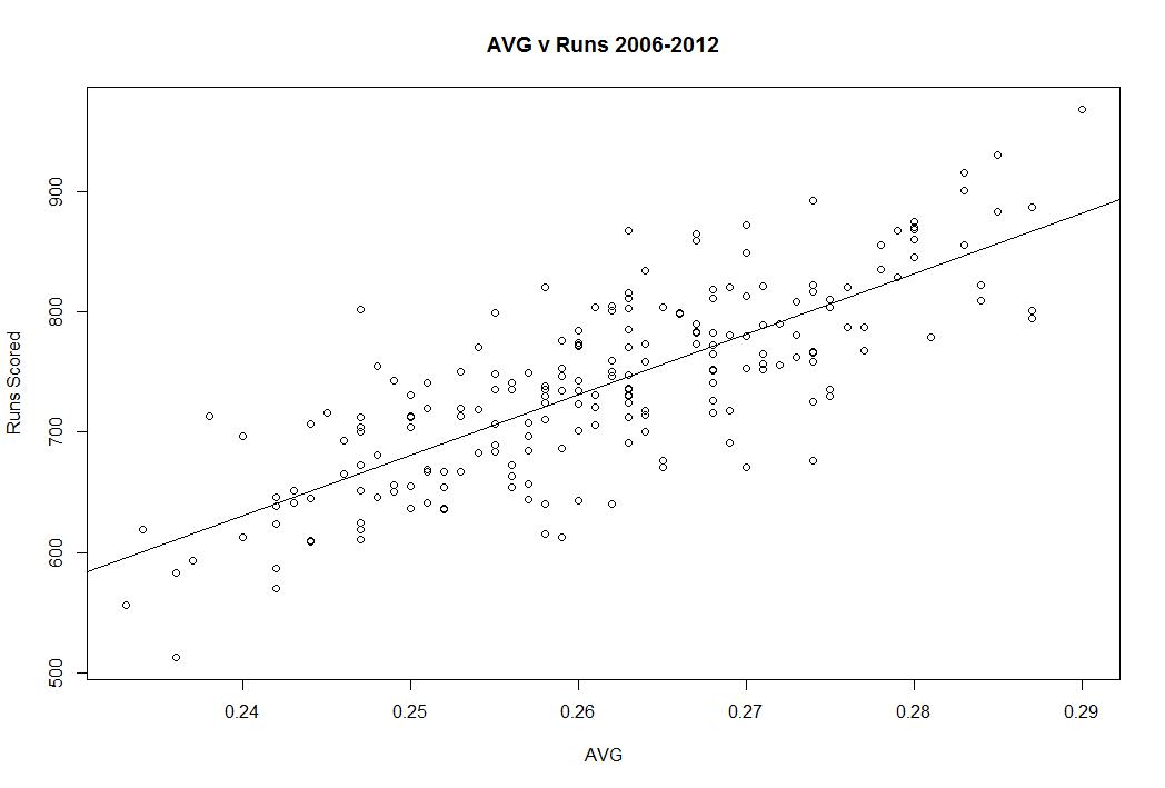
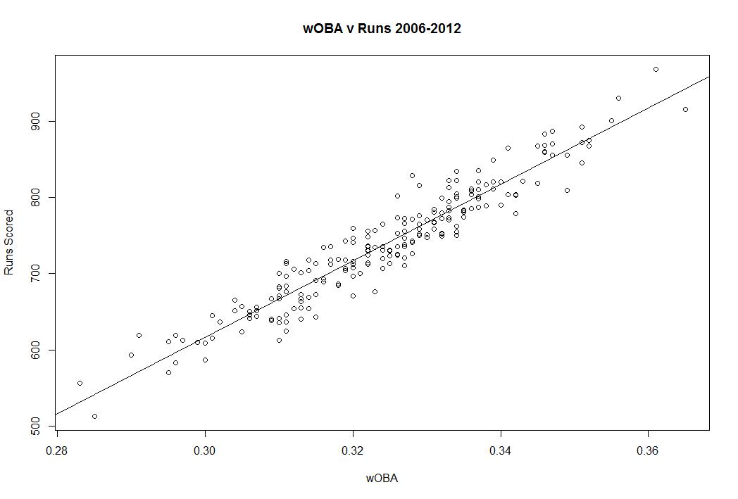
Let’s do something very simple to understand the power of OBP vs AVG. I took each team’s seasons from 2006-2012 and compared their runs scored to AVG and OBP. The correlation is much stronger for OBP than AVG. For batting average the adjusted R squared is .612. For OBP, it’s .7738. In other words, you can explain 61% of the variation in runs scored with batting average and 77% of the variation in runs scored with OBP. OBP is more highly correlated with scoring runs than batting average. Why wouldn’t you want to look at stats that better predict scoring? Here it is in graphical form (the vertical axes are the same):

If you’re interested in going further, take a look at wOBA, because wOBA’s adjusted R squared is .9077, which is a lot better. wOBA tells you more about runs scoring than AVG and even more than OBP. Here it is in graphical form:
I think one reason people are resistant to OBP is because batting average is imprinted on the DNA of the game. We know that .300 is a good average and that .400 is iconic. You have a really good idea what each batting average means, but to use OBP you have to learn how to properly adjust your expectations. .300 is a good average, but you don’t really know what the equivalent OBP is. I’m going to help with a simple rule.
The 60 Rule. That’s it. Take a player’s OBP and subtract .060 from it to get it on the batting average scale. The average OBP is about 60 points higher and the standard deviations are similar. This rule won’t be perfect if you’re statistically savvy, but it will allow you to easily interpret OBP.
If a player has a .390 OBP, just drop 60 points and that is essentially as good as a player who hits .330 using batting average. So David Wright’s average last year was .306, but in reality, he was better than that because of his above average walk rate. He’s more like a .330 hitter than a .300 hitter when you factor in the walks if you choose to think in terms of the batting average scale you learned growing up.
If you’re interested in new stats, we have plenty of info in our Stat Primer page, but the key takeaway here is that little steps are important. OBP is telling you exactly what you think batting average should. It’s telling you how often someone gets on base, while batting average tells you how often they get on base when they get a hit in trips to the plate in which they didn’t walk. Which one makes more sense when you put it like that?
Take a look at OBP next time you scan the stats. It’ll help you understand the game a lot better. Ask questions and be curious. If you don’t agree with a statistic, ask yourself why. Think critically. Look at every stat, but OBP is where you should look if you’re interested in the concept batting average is going after.
The Nine Best Seasons Under 70 RBI
By now I’m sure you’ve seen our series explaining why RBI is not a good statistic for measuring individual value. The reasons are simple. RBI is simply too dependent on the quality of the team around you to be a good measure of individual value because the number of baserunners, location of baserunners, and number of outs are outside of a player’s control. To catch you up, we’ve already seen:
- How RBI can mislead you when comparing two players
- How you can have a lot of RBI during a bad season
- And how RBI don’t even out over the course of a career
Now, let’s turn the question on its head. Below you’ll find the best seasons since 1920 (when RBI became an official stat) in which a player had fewer than 70 RBI while also having 600 or more plate appearances. In other words, these are players who had a full season of at bats, played great, and didn’t have many RBI. The ranking uses wRC+ (what’s wRC+?) which is an offensive rate statistic that compares a player to league average and park, meaning that you can use it to compare across eras. 100 is average and every number above or below is a percent better or worse than league average.
| Rank | Season | Name | Team | PA | RBI | AVG | OBP | SLG | wRC+ |
| 9 | 1938 | Arky Vaughan | Pirates | 650 | 68 | 0.322 | 0.433 | 0.444 | 150 |
| 8 | 1993 | Rickey Henderson | – – – | 610 | 59 | 0.289 | 0.432 | 0.474 | 151 |
| 7 | 1968 | Pete Rose | Reds | 692 | 49 | 0.335 | 0.391 | 0.470 | 151 |
| 6 | 1975 | Ken Singleton | Orioles | 714 | 55 | 0.300 | 0.415 | 0.454 | 152 |
| 5 | 1987 | Tony Gwynn | Padres | 680 | 54 | 0.370 | 0.447 | 0.511 | 153 |
| 4 | 1974 | Rod Carew | Twins | 690 | 55 | 0.364 | 0.433 | 0.446 | 153 |
| 3 | 1968 | Jimmy Wynn | Astros | 646 | 67 | 0.269 | 0.376 | 0.474 | 159 |
| 2 | 1974 | Joe Morgan | Reds | 641 | 67 | 0.293 | 0.427 | 0.494 | 162 |
| 1 | 1988 | Wade Boggs | Red Sox | 719 | 58 | 0.366 | 0.476 | 0.490 | 167 |
What you can see from this list is that these are excellent seasons and none of them gathered more than 68 RBI. Let’s put this in the modern context. In 2012, only 8 players had a wRC+ of 150 or better. Cano, Encarnacion, Fielder, McCutchen, Braun, Posey, Cabrera, and Trout. On the other hand, 80 players had 70 or more RBI in 2012. Among them were Alexei Ramirez who had 73 RBI and a 71 wRC+ and Delmon Young who had 74 RBI and a 89 wRC+.
Usually big RBI numbers and high wRC+ go hand in hand, but there is a lot of variation that obscures the results. Good hitters usually have a lot of RBI, but not always. You’ve seen it in our previous posts on the subject and now you can see that great seasons don’t guarantee you anything in terms of RBI.
RBI isn’t the worst statistic in the world, but it just isn’t a good way to measure individual value when you consider how some players can have 100 RBI in a year and be 25% below average and some can have fewer than 70 RBI and be 50% better than league average. These numbers don’t even out over an entire career and you can’t use RBI to compare two players.
There isn’t a lot RBI can tell you about individual players. You can be good and not have them, you can be bad and have them, and this isn’t about small samples. RBI describe what happened on the field, but they are a blunt and unhelpful tool in measuring individuals. It’s time to move forward and stat lining up our valuations with better measures like wOBA, wRC+, and wRAA. If you use RBI to measure players, you going to end up thinking Ruben Sierra’s 1993 season in which he had 101 RBI is better than Rickey Henderson’s 1993 in which he had 59 RBI when in reality Sierra was 20% below average and Henderson was 50% below average. That’s way too big a mistake to make when there are much better alternatives.
RBI Are Misleading Even Over Entire Careers
In keeping with the recent theme, I’d like to take another look at RBI as a statistic. Recently, I’ve shown you why RBI can be misleading when comparing two players’ value and why having a lot of RBI doesn’t necessarily mean you had a good season. To catch up on these and other similar posts about baseball statistics, check out our new Stat Primer page.
Today, I’m turning my attention to RBI over entire careers. You’ve seen already that RBI aren’t a good way to measure players in individual seasons, but we’ve yet to see how well they do at explaining value in very large samples. The answer is not much better.
To evaluate this, I took every qualifying player from 1920 (when RBI became and official stat) to 2013 (2,917 in all) and calculated their career RBI rate by simply taking their RBI/Plate Appearances. This will allow us to control for how often each player came to the plate so Babe Ruth’s 10,000 PA can go up against Hank Aaron’s nearly 14,000. Next, I compared that RBI Rate to wRC+ (what’s wRC+?) which is a statistic that compares offensive value to league average while controlling for park effects. The simple explanation is that wRC+ is a rate statistic that controls for league average, meaning that a 110 wRC+ means the same thing in 1930 as it does in 1980. League average is 100 and every point above or below is a percent better or worse than league average in that era.
The results aren’t great for RBI as an individual statistic. Overall, the adjusted R squared is .4766 which means that about 48% of the variation in wRC+ can be explained by variation in RBI Rate. Put simply, players who have more RBI per PA are better hitters on average than those with fewer, but there is a lot of variation that isn’t explained by RBI Rate meaning you can’t just look at RBI and know how good a player was.
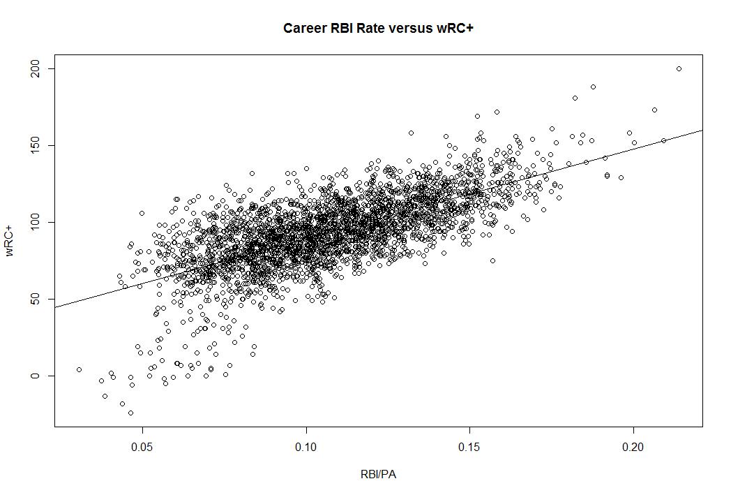
What this graph is showing you is quite striking. First, notice how many players have similar RBI Rates who have wildly different wRC+ and second notice how players with the same wRC+ have wildly different RBI Rates. Generally more RBI mean you’re better, but there’s a lot left unexplained by this stat.
Like I’ve said before, RBI isn’t a made up stat that is useless like wins for a pitcher because RBI reflects a real event on the field and is critical for score keeping. The problem with RBI is that it is too dependent on context and the team around you. Two players who are equally good on offense can have very different RBI Rates because they have a different number of opportunities to drive in runs. Similarly, players who drive in the same number of runs may be much different offensive players in terms of quality.
Even if you’re someone who thinks clutch hitting is a predictive skill, surely you can recognize that RBI is extremely context dependent. Your RBI total depends on how good you are, but also how many runners are on base, how many outs there are, and where the runners are positioned on the bases – all of which you have no control over as a hitter.
I’m on the front lines of the #KillTheWin movement, but I don’t think we should kill the RBI. The RBI just needs to be put in proper context and understood as a descriptive stat and not a measure of player value. Miguel Cabrera gets a lot of RBI, partially because he’s awesome, but also because his team gets on base in front of him all the time. Driving in runs is an important part of winning, it just isn’t an individual statistic. It’s a team statistic and we should view it as such.
You’ve seen that RBI can mislead you when comparing two players, that bad players can have a lot of RBI, and now you’ve seen that this isn’t something that evens out over time. RBI is simply not a good way to measure individual value when it can tell you the wrong thing this much of the time. There are better ways to measure the same concepts like wOBA, wRC+, and wRAA. Feel free to click on the links to learn more and check back for more on why you should put less stock in RBI.
RBI Is A Misleading Statistic: A Case Study
One of our missions here at New English D is to help popularize sabermetric concepts and statistics and diminish the use of certain traditional stats that are very misleading. If you’re a return reader, you’ve no doubt seen our series about the pitcher win:
- The Nine Best Seasons Under 9 Wins
- The Nine Worst 20 Win Seasons
- Comparing Wins Over Entire Careers
- A Case Study from 2012 about Wins
- 12 Assorted Facts Regarding Wins
I encourage you to read those posts if you haven’t already, but I’m confident in the case I’ve laid out. Wins aren’t a good way to measure pitchers’ performance and I’ll let those five links stand on their own. Today, I’d like to move forward and pick up the mantle with another statistic that is very misleading based on how it is currently used: Runs Batted In (RBI).
I’ll have a series of posts on the subject, but I’m going to start with a case study in order to explain the theory. RBI are a bad statistic because they are a misleading measure of value. Most people consider RBI to be really important because “driving in runs” is critical to success, but RBI is very much dependent on the performance of the other players on your team. A very good hitter on a bad team will have fewer RBI than a good hitter on a good team because even if they perform in an identical manner, the first hitter will have fewer chances to drive in runners. Even if they have the same average, on base, and slugging percentages overall and with runners on and with runners in scoring position. The raw number RBI is a blunt tool to measure the ability to drive in runs.
Factors that determine how many RBI you have outside of your control are the number and position of runners on base for you, the number of outs when you come to the plate with men on base, and the quality of the baserunners. If you get a hit with runners in scoring position 40% of the time (a great number) but there are just 100 runners on base for you during a season, you will get no more than 40 RBI. If you get a hit 40% of the time and have 400 runners on base for you during a season, you could have 100 RBI. That’s a big difference even if you perform in the same way.
I’m not making the case here that RBI is completely meaningless and that hitting with runners on base is exactly the same as hitting with the bases empty, but simply that RBI as a counting stat is very misleading. Even if you think the best hitters are the guys who get timely hits and can turn it up in the clutch, you surely can appreciate that certain guys have different opportunities to drive in runs. RBI is very dependent on context and that means it’s not a very good way to measure individual players.
Allow me to demonstrate with a simple case study. Let’s start with comparing two seasons in which the following two players both played the same number of games.
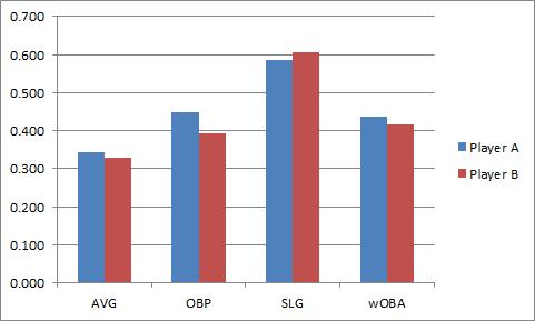
As you can see, Player A leads in average, OBP, and wOBA (what’s wOBA?) and is just a but behind in slugging. In wRC+, Player A leads 177 to 166 over Player B. If we take a look at BB% and K%, Player A looks much better.

All in all, Player A is the better player. We’ve looked at all of their rate stats and we’ve looked at wRC+ which controls for league average and park effect. It’s hard to argue that Player B is better. I couldn’t make a case to that effect.
Here’s the big reveal which some of you have probably figured out. Player A is Miguel Cabrera in 2011, Player B is Miguel Cabrera in 2012. This is the same player during two different seasons. In 2011, when Cabrera was clearly the better player, he had 105 RBI. In 2012, when he was worse, he drove in 139. Everything tells us he was better in 2011 except RBI. That should make use skeptical. It’s even more of a problem when you consider his situational hitting.
The graphs below are on identical scales:

Cabrera was better in 2011 in every situation and by each statistic except for his average (very close) and slugging percentage with no one on base. Which tells you nothing about how well he drives in runs. If you look at the HR distribution it tells you the same story.
| HRs | 2011 | 2012 |
| Bases Empty | 14 | 27 |
| Men on Base | 16 | 17 |
| Men in Scoring | 10 | 9 |
We can give him credit for those solo HR RBI from 2012, so let’s just lop 13 off the top. That still leaves 2012 Cabrera with 21 more RBI than 2011 Cabrera. Cabrera had a better season in 2011, but he had fewer RBI than in 2012. Most of this can simply be explained by the Tigers’ team OBP in the two seasons and where he hit in the lineup. If you subtract out Cabrera the Tigers got on base about 32% of the time in 2011 and 32.4% of the time in 2012 while Cabrera got to the plate a little less often because he hit 4th instead of 3rd. So there are more baserunners in general in 2012, but we can break this down even further.
In sum, Cabrera actually had more runners on base for him in 2011 than in 2012 but that doesn’t really tell the whole story. Let’s break it down by the number of baserunners on each base when he came to the plate:
| 2011 | 2012 | |
| Runner on 1B | 235 | 212 |
| Runner on 2B | 150 | 146 |
| Runner on 3B | 74 | 86 |
This should tell you the story even better. Cabrera had more baserunners in 2011, but the baserunners in 2012 were more heavily slanted toward scoring position. Cabrera had more runners closer to the plate so it’s easier to drive them in.
I intentionally chose Cabrera for this example because it strips away the idea that a given player just “has a knack” for driving in runs. Cabrera is an “RBI guy” if you subscribe to that idea. Miguel Cabrera had a better season in 2011 than 2012 when you break it down overall and in contextual situations. The only thing that helped 2012 Cabrera accumulate more RBI is that he had more runners on base closer to home when he got there. He played no role in getting those runners on base or closer to home, but he was able to more easily drive them and get credit in the RBI column. This is also isn’t as simple as converting RBI into a simple rate stat because where the baserunners are located and how many outs there are matter too, not just the number of situations.
This is the first step in a longer conversation but the takeaway point here is that RBI is stat that depends a lot on the team around you. Cabrera can’t control how many runners get on base and where they are on the bases when he comes to the plate. We shouldn’t judge a player for where he hits in the lineup and how the rest of the hitters on the team perform. It’s important to hit well with runners on base. I personally think we overvalue that skill over the ability to hit well in general, but I’ll leave that alone for now. Can we at least agree that a player who hits better with runners in scoring position and overall should be considered the better hitter? If that’s the case, then RBI is misleading you as an individual statistic. It’s that simple. I’m going to start laying out more evidence over the next couple weeks so stay tuned, but I’ll leave with this.
RBI is a descriptive statistic. It tells you who was at bat when a run scored and is critical to keeping track of a game in the box score. That’s why it was invented in the 1920s. You want to be able to scan a scorecard and recreate the game. RBI has a place in baseball, but only as a descriptive measure, not as a measure of value. Yet the RBI is still critical to MVP voting, arbitration salaries, and overall financial health of the players. They are judged by a statistic that doesn’t measure individual value and it is bad for their psyches. Players should focus on stats they can control and RBI isn’t one of those. It doesn’t measure individual value because as you can seen, in this very controlled example, RBI is misleading you.
