My Good Faith Critique Of DRA

Note: This isn’t a Tigers post. If you’re here for the Tigers, feel free to ignore. Also, I’m publishing this here rather than at FanGraphs because 1) I don’t want the general public to get the idea that FanGraphs as an institution is throwing shade at DRA and 2) I don’t want the perception that anything I’m saying is done in the service of driving traffic or subscriptions to or from either site.
Evaluating pitchers is very hard, but that hasn’t stopped people from trying. Wins and losses. ERA. WHIP. FIP. These are all statistics that at one point or another had been at the forefront of the quest for The Best Single Metric. A wise person might suggest that searching for one metric to rule them all might be a silly quest, but even if we all decided to properly use every tool in the toolbox, there would still have to be a best metric among the useful ones.
Two years ago, the Baseball Prospectus stats team took a swing at building the next generation of pitching metrics, led by their top-line creation, Deserved Run Average (DRA). Many in our little corner of the world treated this as near second coming because it was first high-level attempt to get beyond the FIP-generation of metrics and some of the smartest people in the public analysis sphere had thrown their intellectual heft behind the effort.
DRA promised to incorporate a lot of information that hadn’t found its way into FIP while also taking a more complex approach to modeling the pitcher-value process. I agree that those are worthwhile goals.
I think FIP is a very useful metric, not just because it does a pretty good job of representing pitcher value but because it is extremely straightforward. I am not saying that simplicity makes FIP a good metric, but rather that its clarity does. FIP has flaws, but its flaws are in perfect view. I know exactly what FIP is doing and exactly what FIP is not doing. And this is precisely where DRA has so far failed to win me as a full convert so far.
I want to be clear that I am not saying DRA is less rigorous than FIP or that it has been designed poorly or in bad faith. My issue with DRA is not that I think there is something wrong with it, it’s that I don’t really know what to make of it. My argument is not that FIP is a better representation of pitcher value than DRA, it’s that I am less certain about the quality of DRA than I am the quality of FIP.
Imagine FIP and DRA are diamonds. I can hold FIP in my hand and examine it under a magnifying glass. DRA is on a table twenty feet away. I can see the exact quality of the FIP diamond, but I can only tell that DRA is a diamond. Smart people who cut the DRA diamond are telling me they think the DRA diamond is better, but I have not been able to see them side by side.
In my own analysis and in my own writing, I have utilized DRA but I still lean heavily on the FIP-family of metrics for this reason. If I’m writing about a player and want to communicate something, I prefer FIP to DRA because I can talk clearly about what FIP says. If I want to use DRA I can only say that based on the complex method it deploys, the pitcher is this good/bad/other.
Now many strong advocates of DRA will tell you that its complexity is good. Pitching, after all, is very complicated so it follows that any statistic that measures pitching holistically should also be complicated. That’s a very convincing point, but as I noted earlier my problem is not complexity, it’s clarity. I love complicated things. I’ve taken graduate-level courses in statistics and modeling. I am in no way turned off by DRA in concept. At no point in this piece am I saying DRA should be less complex.
However, there are two clear issues with DRA that prevent me from using it as my primary point of reference. The first is that the BP team has not outlined a justification for its modeling strategy. If you read through their explanations (see here, here, here, and here) what you find is a list of flaws that exist with other pitching metrics. “FIP doesn’t have X, X matters, so we put X in our model. We know pitchers control their BABIP to some degree, so we put that in the model.”
This creates a couple of issues. The first issue is that I can’t see what components are doing the lifting (for example, this page needs to be way more granular). Does a player have a good DRA because their opponents are very tough or because their defense is terrible? DRA jams a lot of information into a single output and that makes it quite difficult to use in any sort of interesting way. FIP only has five inputs (strikeouts, walks, hit batters, home runs, and balls-in-play) and even that can feel overly aggregated. DRA has even more inputs that have run through even more aggregation. That might provide DRA with a more accurate output but it blurs a lot of lines. This pitcher might be good, but I have no idea why he’s good.
More importantly, however, is the fact that the BP team has not thoroughly explained why their modeling choices (structure, not inputs) are the proper modeling choices. DRA is a complex model, and while complexity is good, complexity also means that there were hundreds of choices made along the way that could have made differently and produced differently outcomes. In other words, DRA is built on a lot of choices made by people about how to incorporate something and those choices have not been explained and defended. As I noted earlier, the choices may be correct, but I have no way of evaluating them if they do not explain how they came to them.
Here’s an excerpt from the Gory Math DRA post:
What is the best way to model this relationship? That required a lot of testing. A LOT of testing. We tried linear models. We tried local regression. We tried tree-based methods. We bagged the trees. We tried gradient boosting. We tried support vector machines. We even tried neural networks. None of them were providing better results than existing estimators. And then we tried the one method that turned out to be perfect: MARS.
MARS stands for Multivariate Adaptive Regression Splines, and was introduced by Dr. Jerome Friedman of Stanford in 1991. You don’t hear much about MARS anymore: it has been supplanted in the everyday modeling lexicon by trendier machine-learning methods, including many of those we mentioned above. But MARS, in addition to being useful for data dumpster-diving, also has another big advantage: interactions.
MARS uses what are known as regression splines to better fit data. Instead of drawing a straight line between two points, MARS creates hinges that allow the line to bend, resulting in “knots” that accommodate different trends. The power of these knots is enhanced when MARS looks at how variables interact with each other. These interactions are, in our opinion, one of the under-appreciated facts in baseball statistics.
As discussed above, pitchers who are pitching particularly well or poorly have a cascading effect on other aspects of the game, including base-stealing. Moreover, there is a survival bias in baseball, as with most sports: pitchers who pitch more innings tend to be more talented, which means they end up being starters instead of relievers or spot fill-ins. The power of MARS is it not only allows us to connect data with hinged lines rather than straight ones, but that it allows those hinges to be built around the most significant interactions between the variables being considered, and only at the levels those interactions have value. MARS also uses a stepwise variable selection process to choose only the number of terms sufficient to account for the most variance.
Most people won’t be able to make heads or tails of this section and it’s incumbent upon BP to make it more accessible, for one. But even granting a pardon for that, as someone knowledgeable in these issues, I don’t know if this strategy is a good one or a bad one. They made all sorts of choices based on various tests and I am simply asked to accept they chose the right one and that there isn’t a better option out there.
Now you might say that it isn’t their job to teach me how to literally write R code and test my own model so that I can probe the ether for things I think might be imperfect within DRA. Of course they shouldn’t be asked to test literally every possible model specification when building DRA, but you have to give me more information about why you chose to build it like this as opposed to some of the other approaches you tried or could have tried.
On the other hand, with something like FIP, all of the decisions are on display. You might think the decisions are wrong, but you can see the decisions and make that judgement. There are five inputs with a set of clear weights. That’s all FIP is, and while that limits FIP in terms of accuracy, FIP is extremely clear. I can’t make that judgement with DRA. A stronger and clearer defense of the specifications needs to be made.
And this leads me to my second key issue with DRA that prevents me from using it in a more serious way. DRA is two years old and has already had three major iterations that worked differently in meaningful ways. I have no problem with updating your metrics based on new data or new research, and I don’t think there is an inherent problem any of the specific changes they have announced. The problem is that DRA-2015, DRA-2016, and DRA-2017 have different views of the same seasons and I have a strong suspicion that DRA-2018 will lead to more of these cases.
The rapidity with which DRA has been revised indicates the BP team’s willingness to explore improvements (which is great!) but it also suggests to me that they haven’t figured out the right way to model the underlying data generating process.
When they announce a revision, they are stating that the previous version failed to capture something they found essential. It’s one thing if these changes were exclusively based on new data, but they are also based on changes to the modeling. And if the results are that sensitive to tweaks in method, I am suspect about the entire system. That doesn’t mean that FIP is necessarily better than any particular version of DRA, simply that I know that in a few months DRA is going to change and a pitcher I thought way decent might actually be kind of bad even though we didn’t learn anything new about the pitcher himself.
Put another way, are the things BP learned about DRA between 2015 and 2017 things they couldn’t have learned by exploring more specifications before the initial rollout? I am not saying they should hold the release back until it’s perfected because public input makes things better, but simply that the first few years are more akin to a beta test. I’m not ready to fully adopt the metric until it settles in a little more. That’s not me dismissing DRA or its potential value to the world of baseball analytics. I really like DRA from a conceptual perspective, but my perception is that the nuts and bolts are subject to change quite frequently, so I have yet to dive in without a life preserver.
I want to reiterate that none of this is a critique of any individual decision and it is decidedly not an argument that FIP is a better representation of pitching value than DRA. That is a separate argument that can be had on separate terms. But I do think that DRA is not as useful as FIP at this point in time. I am hesitant to use a metric whose workings I can’t see. I don’t know if the modeling strategy is correct and I am pretty sure that in a few months a chunk of pitchers will have totally different DRAs.
I also want to be clear that none of this is intended as shade or inter-nerd sniping. I have great respect for the BP stats team and have shared these critiques with them. This is not a take down, it’s a list of demands.
I think DRA is aiming in the right direction, I just haven’t been given enough information to figure out if it’s really an improvement over its predecessors. Building a metric like DRA makes all the sense in the world and some great people are in command, but it will remain a complementary metric for me until it is unpacked in a way that allows me to trace its design.
So here is what I would propose:
- Create an expanded version of the DRA run value page that includes every individual component so that people can see how the different factors are operating. It takes two seconds to figure out why FIP likes someone or doesn’t. Doing so with DRA is next to impossible.
- Go back to the drawing board on the public facing explanation and give clearer explanations of how DRA works and why it works that way. DRA is complex, but you can explain complex things in a clear manner if you break it down into less complex pieces and work with outsiders to ensure they follow the explanation at each step.
- If DRA is meant to be a living, breathing statistic that gets updated annually, then be willing to accept ongoing skepticism about the execution of the statistic. If you are rejiggering it frequently, then the audience is going to wonder if the current version is the right one. If you want to avoid that, you have to change the name each time you change the stat. I get that this is annoying, but it’s part of the job.
New English D Stat Calculators!

If you’re new to New English D this year, you might not be aware of this feature, so I thought I’d put out a quick reminder. If you haven’t been to our stat primer page, it offers tons of background on the advanced stats we use here and why they are better than the more traditional numbers. But built into four of those pages are calculators that you can play around with on your own. Fill out the boxes and you can get values for FIP, xFIP, wOBA, and WAR. I can build others if you’d like as well.
Enjoy and please report any problems. Be aware that they can take a few seconds to respond if many people are using them.
Wins Above Replacement (WAR) Calculator
One of the missions of New English D is to make sabermetrics more easily digestible. To that end, we have an extensive Stat Primer series that explains a lot of important concepts and stats. One of the most controversial, but important stats out there is Wins Above Replacement (WAR). I wrote about WAR over a year ago here, so feel free to read that as a primer for what WAR is trying to measure. I also apologize if it’s not perfectly written, as it was one of the first pieces I put out there and was still working to develop some expert internet-writing skills.
Calculate FIP, xFIP, and wOBA too!
That said, people often complain that WAR is really too complicated and it doesn’t make sense to them. Well, I’m going to give you the tools to calculate WAR right here and right now. I will make two quick points.
- This is an approximation of the FanGraphs version of WAR for position players, not pitchers.
- This is not perfect, mostly in the sense that it does not account for park factors. If your fake player plays in a hitter friendly park, this number will be too high. If they play in a pitcher friendly park, it will be too low. Not a huge amount, but some. This calculator isn’t perfect because in order for it to be perfect, I would have to ask you to input way more information and I would have to learn how to be a much better coder.
- This doesn’t account for league, which makes a small difference and it doesn’t break down by number of games played at different positions if your player plays more than one.
Here is how it works. Fill in the data from Cell B2 to Cell B11 with the basic statistics of your player. In Cell B17, type the number that corresponds with their position in the “H” column. In Cell B18, type the number of runs above or below average you player is on defense. A perfectly average defender at the position in question will be zero. Remember these are run values and generally range from -10 to +10. Do the same thing with baserunning runs in Cell B19. If you want more information on any of these numbers, visit our Stat Primer page for details.
If you’ve done everything correctly, you should have a WAR value in B20. Remember, this doesn’t adjust for park or league, so it won’t be perfect, but it should give you a pretty nice idea if you’re just looking to play around with some numbers. Essentially, this is a “what if WAR machine.”
Right now, these numbers reflect the 2013 regular season. Feel free to play around with the numbers in the blue box if you wish to calculate based on different seasons. All of the numbers can be found on this FG page with the exception of Lg R and Lg PA, which are simply the total number of runs and plate appearances in the league that season.
Enjoy and feel free to post if you catch any mistakes. This one was much harder to write than FIP, xFIP, and wOBA.
The Nine Worst Wins of 2013
If you’re here, you’ve likely been exposed to our series on pitcher wins and why we want to kill them. It’s become a pretty big topic of conversation around baseball and some people are calling for a cease fire because the win has been repeatedly slaughtered to the point that we’ve probably violated the Geneva Convention. So, I’ll make sure to avoid overdoing it because apparently #KillTheWin is sabr-bullying. If you’re new to the cause, check out the groundwork for why wins are a terrible statistic and then enjoy The Nine Worst Wins from 2013 (as of Sept 13th).
- You Can Have A Great Season and Not Win
- You Can Have A Bad Season and Win A Lot
- Wins Don’t Even Out in Big Samples
- A Case Study in Wins
- 12 Assorted Facts About Wins from 2013
- Dissecting the Case for Wins
- A Replacement for Wins
So the methodology is quite simple. Below are the pitchers in 2013 who have earned a “win” sorted by the lowest Win Probability Added (WPA). What WPA does is measure how much the team’s likelihood of winning changed as a result of every play and assigns that value to the pitcher and batter who took part. It’s not a perfect stat for measuring a player’s performance but it works for our purposes here for a simple reason. If a pitcher’s team scores 10 runs in the first inning, that pitcher can pitch poorly and get a win, but most of the pro-win alliance thinks that’s okay. They believe in something called “pitching to the score” which has been shown to be fiction. So in order to make the point clearly, I’ll use WPA which is entirely dependent on context. If you’re up 10, you’re allowed to give up 5. If you’re up 1, you better not give up two.
There are other ways to do this, but I think this is the most valuable way to do it given the audience still in need of persuasion.
| Rk | Player | Date | Tm | Opp | Rslt | App,Dec |
| 9 | Randall Delgado | 2-Aug | ARI | BOS | W 7-6 | GS-6 ,W |
| 8 | Brandon League | 31-May | LAD | COL | W 7-5 | 9-9 ,BW |
| 7 | CC Sabathia | 18-Aug | NYY | BOS | W 9-6 | GS-6 ,W |
| 6 | Alfredo Simon | 22-Apr | CIN | CHC | W 5-4 | 13-13f,W |
| 5 | Rafael Soriano | 17-May | WSN | SDP | W 6-5 | 9-9 ,BW |
| 4 | Matt Belisle | 28-Jul | COL | MIL | W 6-5 | 8-8 ,BW |
| 3 | Joe Smith | 26-Jun | CLE | BAL | W 4-3 | 8-8 ,BW |
| 2 | Michael Wacha | 19-Aug | STL | MIL | W 8-5 | 7-7 ,BW |
| 1 | Kyuji Fujikawa | 12-Apr | CHC | SFG | W 4-3 | 9-9f ,BW |
| Rk | Player | IP | H | R | ER | BB | SO | HR | Pit |
| 9 | Randall Delgado | 6 | 6 | 6 | 4 | 1 | 7 | 2 | 97 |
| 8 | Brandon League | 1 | 2 | 2 | 2 | 0 | 1 | 1 | 26 |
| 7 | CC Sabathia | 5.1 | 7 | 6 | 6 | 5 | 5 | 1 | 103 |
| 6 | Alfredo Simon | 1 | 1 | 2 | 1 | 0 | 1 | 1 | 15 |
| 5 | Rafael Soriano | 1 | 4 | 2 | 2 | 0 | 0 | 0 | 19 |
| 4 | Matt Belisle | 1 | 2 | 2 | 2 | 0 | 2 | 1 | 23 |
| 3 | Joe Smith | 1 | 3 | 2 | 2 | 1 | 0 | 0 | 21 |
| 2 | Michael Wacha | 1 | 4 | 3 | 3 | 0 | 1 | 1 | 30 |
| 1 | Kyuji Fujikawa | 1 | 3 | 3 | 3 | 0 | 0 | 0 | 30 |
| Rk | Player | ERA | RE24 | WPA |
| 9 | Randall Delgado | 6.00 | -2.939 | -0.392 |
| 8 | Brandon League | 18.00 | -1.479 | -0.404 |
| 7 | CC Sabathia | 10.12 | -3.472 | -0.410 |
| 6 | Alfredo Simon | 9.00 | -1.537 | -0.417 |
| 5 | Rafael Soriano | 18.00 | -1.594 | -0.430 |
| 4 | Matt Belisle | 18.00 | -1.479 | -0.431 |
| 3 | Joe Smith | 18.00 | -1.490 | -0.528 |
| 2 | Michael Wacha | 27.00 | -2.537 | -0.557 |
| 1 | Kyuji Fujikawa | 27.00 | -2.537 | -0.745 |
To date, there have been 282 wins in which the pitcher had a negative WPA in 2013. Above you’ve seen the nine worst including Fujikawa having just about the worst performance I could imagine in a win using this method. In fact, as far back as we have WPA data, it’s the 14th worst such win.
It looked like this! That’s pretty bad.

This is all by way of saying that wins aren’t a useful statistic and that even if we allow for the idea of pitching to the score, we still have a ton of ridiculous wins every season. If every win was handed out perfectly the rest of the season, we would still have seen 11.6% of the wins in 2013 go to pitchers who hurt their team’s chance to win.
#KillTheWinButDoItWithoutBeingSoDramatic
Could We Assign “Wins” Differently?
If you’ve been here before, or someone like Brian Kenny tweeted a link to this post, you know that we are big proponents of the #KillTheWin movement. We don’t like wins and losses as a pitching statistic for many reasons. You can pitch well and not get a win, you can pitch terribly and get a win, wins don’t even out, and wins are extremely misleading. Put simply, wins are dependent on things that pitchers can’t control and it’s silly to measure them based on something their teammates do. Here are links to all of our formative #KillTheWin work:
- You Can Pitch Great and Not Win
- You Can Pitch Poorly and Win
- Wins Don’t Even Out Over Long Careers
- Wins Mislead You When Comparing Players
- Assorted Facts About Wins from 2013
- Dissecting the Case in Support of Wins
But today I’d like to address a solution that a lot of people are calling for. You see, the old guard won’t let go of the wins and losses concept and language. They can’t accept things like FIP, xFIP, and WAR, or even K%, BB%, GB%. Even ERA is doesn’t satisfy their longing for the “W.” So I’d like to propose a simple idea that simply changes the methodology for awarding wins and losses. Currently, a starter has to pitch at least 5 innings, leave with a lead, and not watch the bullpen surrender that lead. If we invented wins and losses today, no doubt we wouldn’t use such a silly rule.
So let’s use a better one. If there is an appetite for Wins and Losses, why don’t we actually tie wins and losses to performance? Here are two basic proposals that do that while solving a couple of key issues with wins.
The first problem with wins and losses is that it depends on how much and when your team scores. So what we want is something that only measures the impact of the pitcher on the game. Another problem with wins and losses is that the no-decision essentially erases everything you did on a given day. If a pitcher throws 7 shutout innings and gets a no decision, that game shows up in every single one of his stats except wins and losses. We want to judge every start a pitcher makes, not just one in which the right conditions are met by his offense and bullpen.
To partially resolve this issue, let’s turn to the 2013 Tigers as an example. Instead of wins and losses as determined by the current rule, what if we allocate them by Win Probability Added (WPA) or Run Expectancy 24 (RE24)? Those two stats are a bit complicated to calculate, but extremely easy to understand. WPA reflects the percentage by which a player improved his team’s chances of winning. It is very context dependent, but you can still earn positive values even when your team is losing. RE24 is a similar statistic except it doesn’t pay attention to the score of the game and just reflects how many runs above or below average you are contributing. Think of it this way, in a 10-0 game a solo homerun has a pretty low WPA because the game is already decided, but it has the same RE24 in a 10-0 as it does in a 2-0 game. Both allow for the addition of value in a context dependent sense, but both also allow a player to add value even when his team is not. Both of these stats are readily available on FanGraphs and Baseball-Reference.
Below I present the 2013 Tigers with WPA and RE24 “wins.” If a pitcher has a positive WPA or RE24 for a single game they get a win. If it’s negative, they get a loss. No no-decisions and no concern about how the game actually ended. Did the pitcher improve his team’s chances of winning a single game? That’s what wins and losses should tell us, so let’s try this.
There are obvious weakness to this approach, namely that I’m not addressing by how much a pitcher helped his team, but to answer that question, we have season long numbers that are more important. This approach is meant to give people who want to see wins and losses a better reflection of true value.
| Pitcher | Starts | W-L | WPA W-L | RE24 W-L |
| Fister | 28 | 12-7 | 18-10 | 19-9 |
| Sanchez | 24 | 12-7 | 16-8 | 17-7 |
| Scherzer | 27 | 19-1 | 22-5 | 22-5 |
| Verlander | 29 | 12-10 | 17-12 | 18-11 |
| Porcello | 26 | 11-7 | 15-11 | 16-10 |
You will notice a couple of things. You’ll notice that Scherzer’s no-decisions are primarily the function of his team bailing him out and Fister, Sanchez, and Verlander’s are almost all a case of the Tigers not providing enough run support. Porcello’s are divided pretty evenly. This is interesting because it shows that even on individual teams, wins/losses/no decisions are handed out irregularly despite the same contingent of position players.
For the die-hard #KillTheWin-er, this approach is still too context dependent and derived from an illogical attempt to hand wins and losses to a single player. But for a more traditional observer, hopefully this is compelling. Even if you like wins and losses, surely you can appreciate that the actual way in which wins and losses are assigned is arbitrary and foolish. Why is 5 innings the cutoff? Why do you not get a win if you pitch 8 shutout innings and your team wins in a walkoff? Why should you get a win if you allow 6 runs? Even if you want to track day to day contribution, at least track it in a way that reflects what the player you’re judging actually did.
Now I’m not sure if this is the best way, but this is definitely an improvement over wins and losses as currently defined. The current stat makes no contribution to analysis, this one makes some contribution. I’d still rather pay attention to season long numbers, but if we’re going to judge a player in each individual game, let’s at least do it right.
Jon Heyman Kills The Win While Trying to Save It
Here at New English D we are on the front lines of the #KillTheWin movement. If you’re new to the site and are open-minded, please check out our 5 part series on why wins aren’t useful:
- You Can Pitch Great and Not Win
- You Can Pitch Poorly and Win
- Wins Don’t Even Out Over Long Careers
- Wins Mislead You When Comparing Players
- Assorted Facts About Wins from 2013
All of those links make a singular case. Wins are not useful when evaluating individual pitchers. The goal of baseball fans and analysts is to properly understand the game we love. Wins don’t cause poverty, but wins are detrimental to our understanding of baseball because so many people use them as a measure of value, which they are not.
Today, Jon Heyman wrote about Max Scherzer (currently leading the league in wins by a lot) and couldn’t resist fighting back against the #KillTheWin movement. He makes several points. First, he argues that Scherzer should narrowly beat Felix for the AL Cy. Hey, we agree on that! Second, he says those of us trying to kill the win are wasting our time. That’s silly because we enjoy killing the win and baseball is about having fun, but I’m not going to engage in pettiness when the real issues are much more important.
Next, Heyman says:
Wins do matter (though clearly not nearly as much as we once thought — and I give the stat guys credit for pointing this out.) No starter gets to 19-1 only because they are lucky, or because they “happened” to be “standing on the mound” when his team scored a ton of runs, as some would have you believe.
So here we see Heyman acknowledge that he places less stock in wins today that he used to. Meaning that he was wrong before and therefore could be wrong again. Furthermore, Heyman says no one goes 19-1 because of luck/happenstance/standing on the mound. Actually, Jon, they do. Scherzer is an excellent starting pitcher, but he is not meaningfully better than Felix. Certainly not better than Kershaw or Harvey. Yet he has many more wins than they do and many fewer losses. The difference is that the Tigers score crazy amount of runs for Scherzer because they are really good at scoring runs. Additionally, he gets more runs than his other rotation-mates. Scherzer gets 7.32 runs per 9. Felix gets 4.73. Chris Sale gets 3.03.
Even if you want to dramatically oversimplify baseball and assume a pitcher controls everything that happens when he is on the mound (he doesn’t), he still has no control over what his offense does. In order to get a win, you have to be in the game when your team takes the lead for the final time. If you team doesn’t score, or scores AT THE WRONG TIME, you do not get a win regardless of how you pitched.
It’s obvious that Heyman knows this based on his comments throughout the piece:
There are a lot better numbers to illustrate a pitcher’s performance over a season than wins and losses.
But does that mean a pitcher’s record is now totally worthless?
Heyman argues that wins are not the most important thing, but that they are not worthless. Which poses the important question at which I will now arrive. What do wins tell us that we can’t see in other stats?
What is the value of seeing a W/L record beyond seeing things like ERA, K%, BB%, GB%, FIP, xFIP, WAR, RE24, SwStr%, IP, etc? What do wins and losses add to the discussion?
Nothing. Not one thing. Heyman says consistency, but that isn’t the case. Check out the link about about “misleading” and you’ll see that argument doesn’t hold water. Good, consistent pitchers can win less often than bad and inconsistent ones. Heyman says wins aren’t about being in the right place at the right time, but they clearly are. The Tigers score a disproportionate number of runs for Scherzer than they do for his teammates. Scherzer is both good and lucky. They aren’t mutually exclusive, but that doesn’t mean he should get credit for something he had nothing to do with.
Scherzer is great. He has an excellent W/L record. Those two things are related, but not highly related. Good pitchers, on average, win more often than bad ones because they have some control over the number of runs they allow but that doesn’t mean judging a player by wins and losses is useful. It adds nothing to our understanding and does more harm than good. Heyman cites Tillman making the ASG as case and point.
Wins influence people’s thinking, whether it’s Tillman in the ASG or it’s Dusty Baker leaving Bailey on the mound when he was losing it so he could “have a chance to get a win.”
My argument here is that wins provide us with no meaningful information and at best are trivial and at worst are negatively impacting games. Heyman concludes:
The goal, ultimately, is to win games when a pitcher takes the mound, and Scherzer has done that better than anybody. Yes, there is a lot of luck involved in getting pitcher wins. But in Scherzer’s case, he has pitched great, too, and no one should claim he hasn’t.
Which is interesting, because the Scherzer is getting a lot of luck as far as wins go. Sale isn’t pitching as well as Scherzer, but he’s not pitching 9-12 to 19-1 worse. Also, Heyman is using a strawman argument in his closing. No one, not one single person, thinks Scherzer hasn’t been great. He’s been amazing. Fantastic. Cy Young or very close to it, brilliant. That’s not what this is about at all. He’s 19-1 and Chris Sale is 9-12. He’s not “10 wins” better than Sale. Not under any real definition of pitching ability or performance. This is a statistic that doesn’t reflect performance at all. It adds nothing to the conversation you can’t get elsewhere. That’s why we want to kill it.
I would like to point out the broader issue. Heyman is actually one of the more evolutionary members of the old guard. He clearly sees the fault in wins, but still wants to defend them. Read his defense. Think about it for yourself, it’s like he wants to hold onto wins because he’s used to them. And that’s not a good reason. “How we’ve always done things” is not a good way to make decisions.
I don’t understand the purpose of Heyman’s argument. Why does he want to save them? What utility do they bring to the conversation? This is not a personal assault on Heyman, but he put his views out there in writing, so they are open to criticism. I’m an academic and a baseball writer, so I know about critical feedback. You’re welcome to criticize my reasoning as well. I can take it, don’t worry. I offered Heyman a chance to clarify his message on Twitter and he has yet to do so. If he writes back, I’ll be glad to amend this post.
There is no value in looking at wins and losses for a starting pitcher. That’s not about Scherzer or Felix, it’s about analysts and fans. In fact, Heyman and his fellow BBWAA members should use their access to go ask Scherzer about wins, or even Google his quotes on the issue. He gets it and he’s the person who benefits most from looking at wins. If he doesn’t care about them, it’s time to let them go.
The Nine Most Misleading Batting Averages of 2013
On this site, we often discuss which statistics are misleading and which statistics are better at determining a player’s value. Over in our Stat Primer section we have tons of posts about why pitcher wins are bad and why RBI aren’t a good way to measure individual players. We also have a post about why on base percentage is better than batting average and why you should use Weighted On Base Average (wOBA) if you’re really only interested in looking at a single number because it weighs each type of hit based on its actual contribution to scoring. You want to look at stats that correlate more highly with scoring and OBP and wOBA are much better than batting average (just click the OBP v AVG link above to see for yourself).
All in all, for hitters I’d tell you to look at Weighted Runs Created Plus (wRC+) because that is a park and league adjusted version of wOBA, meaning that you can compare players at Petco and Camden Yards and players from 2010 and 1960. It’s simple to understand as 100 is average and anything above it is that % better than average and anything below it is that much worse. One of our main goals is to make advanced statistics more popular in the broader baseball community because we think they will improve your enjoyment of the game.
Simply put, many of the traditional stats were invented before we knew enough and had the ability to calculate better ones. It’s always important to move forward. Today, I’m offering a bit of evidence from the 2013 season about why you should look beyond batting average when judging a player. Below you will find The Nine Most Misleading Batting Averages so far this season. The rules are simple. These are players who have a below average batting average and above average offensive value or an above average batting average and below average overall value. Players who had really good batting averages that still undersold their value (think Cabrera) are not included because that would just be a list of the best hitters in baseball and that would be boring.
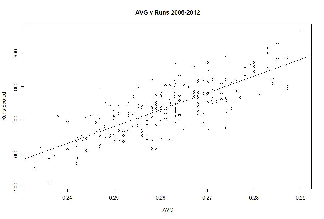
Think of these players as guys who either walk a ton or not at all and/or guys with lots of power or no power. Batting average treats every hit the same and ignores walks. That’s not a good idea. Batting average is a fine stat, but it should only be a compliment to on base percentage if you want something simple and wOBA or wRC+ if you want something more daring. This is a plot of AVG and wRC+ to show you that while batting average is important in determining offensive value, there is a lot it doesn’t explain. About 54% of the variation in wRC+ can be explained by average. Walks, power, and ballpark make up the rest and we shouldn’t ignore them:

It’s important to note that I make no adjustment for position, meaning that these are all deviations from league average (.257 AVG) and not based on their respective positions. These are batting averages that don’t tell the whole story about a player, not batting averages that explain positional value.
| Rank | Name | Team | PA | BB% | AVG | OBP | SLG | wOBA | wRC+ |
| 9 | Jose Altuve | Astros | 436 | 5.50% | 0.284 | 0.323 | 0.362 | 0.298 | 87 |
| 8 | Brandon Moss | Athletics | 346 | 9.50% | 0.241 | 0.321 | 0.456 | 0.338 | 116 |
| 7 | Pedro Alvarez | Pirates | 402 | 8.00% | 0.240 | 0.301 | 0.490 | 0.337 | 117 |
| 6 | Chris Carter | Astros | 390 | 12.30% | 0.214 | 0.315 | 0.432 | 0.327 | 107 |
| 5 | Adam Dunn | White Sox | 418 | 12.90% | 0.217 | 0.323 | 0.457 | 0.337 | 109 |
| 4 | Raul Ibanez | Mariners | 350 | 7.10% | 0.249 | 0.303 | 0.520 | 0.353 | 126 |
| 3 | Jose Bautista | Blue Jays | 457 | 12.90% | 0.252 | 0.348 | 0.496 | 0.365 | 130 |
| 2 | Alexei Ramirez | White Sox | 455 | 3.10% | 0.277 | 0.302 | 0.349 | 0.285 | 73 |
| 1 | Dan Uggla | Braves | 422 | 13.30% | 0.198 | 0.315 | 0.419 | 0.325 | 106 |
What you have is three types of players. One are players who have a high average but never walk and don’t hit for power. Two are players with great walk rates. Three are players with a ton of power. Each of those qualities makes batting average deceptive. We don’t have to get rid of the stat, but it’s important to understand that walking and extra base hits are very important and just dividing hits by at bats doesn’t equal offensive value.
I say this because the person who wins the batting title is only the best offensive player 30% of the time. We call that person the “Batting Champion,” but that’s not really true. Offensive value is more complicated that H/AB and it’s important to start moving towards stats that capture that, especially because we already have those stats and it only requires a few minutes to learn about them.
Hidden Value: Assessing the Tigers on The Bases
Baserunning is pretty much the red-headed stepchild of baseball analysis. We care a lot about hitting. We care a lot about pitching. Most people given a courtesy nod to defense, even if they basically ignore it. But no one talks about baserunning aside from stolen base totals, or maybe stolen base efficiency.
But there is so much more going on on the bases that we could be talking about. Going first to third, scoring on singles, not making outs you don’t have to make. All of these are critical aspects of baserunning that we don’t talk about, but very easily could. In the text of this post I’ll be introducing some statistics (which are very simple) and discussing them in the context of the 2013 Tigers to date (July 30th).
Let’s start by digging deeper on stolen bases. Stolen bases add value to the team, about 1/4 of the value added by a single. But getting caught is costly, and is about twice as costly as stealing a base is beneficial because the value of moving up a base is not as important as not making an extra out. In other words, you need to steal at about a 70% rate or better in order to be adding value to your team overall.
| Name | wSB |
| Andy Dirks | 0.7 |
| Don Kelly | 0.3 |
| Hernan Perez | 0.2 |
| Miguel Cabrera | 0.1 |
| Matt Tuiasosopo | -0.1 |
| Ramon Santiago | -0.1 |
| Omar Infante | -0.2 |
| Alex Avila | -0.2 |
| Austin Jackson | -0.3 |
| Torii Hunter | -0.4 |
| Avisail Garcia | -0.4 |
| Prince Fielder | -0.6 |
| Victor Martinez | -0.8 |
| Jhonny Peralta | -0.9 |
| Brayan Pena | -0.9 |
Presented above are the number of runs each Tiger has added via SB and CS. As you can see, nobody is doing much of anything. The Tigers best basestealer isn’t even up to a full run (10 runs = 1 win) of value and the worst basestealer costs about the same. The Tigers don’t steal a lot of bases, but they don’t get caught a ton either. All told they are a -3.7 wSB, which means their basestealing exploits has cost the team about one-third of a win. Not very significant.
Now let’s take a look at UBR, which is simply the same formula for all other baserunning activities. This includes the value of going first to third and the cost of getting thrown out trying to stretch something. I’m going to talk about some pieces of this in a moment, but first let me give you the overall numbers.
| Name | UBR |
| Austin Jackson | 5.0 |
| Don Kelly | 2.1 |
| Omar Infante | 1.6 |
| Avisail Garcia | 0.7 |
| Miguel Cabrera | 0.6 |
| Alex Avila | 0.6 |
| Ramon Santiago | 0.3 |
| Hernan Perez | 0.1 |
| Andy Dirks | -0.2 |
| Bryan Holaday | -0.6 |
| Jhonny Peralta | -0.7 |
| Brayan Pena | -0.7 |
| Torii Hunter | -1.2 |
| Prince Fielder | -2.1 |
| Matt Tuiasosopo | -2.8 |
| Victor Martinez | -4.6 |
Here we have a chance to see more overall value impact. It will not surprise you to learn that Austin Jackson is the Tigers best runner and that he has been worth half a win to the team simply on the bases (this does not include stealing). Kelly ranks well in this department and despite being slow, Cabrera’s solid instincts help him add value here as well. Dirks is a bit surprising because he’s the team’s best basestealer, but it looks like he doesn’t help much with the ball in play. Overall, the team has a -1.9 UBR, which is just a tick below average. Adding wSB and UBR together, the Tigers have cost themselves something like half a win this season with their baserunning (25th in MLB). You’re not happy about that, but given their collection of lumbering sluggers, it’s nice to see they aren’t giving runs back on the bases they are earning with the bat.
So now that we have an idea about the Tigers overall baserunning value, what are some other things we can track. Let’s start with outs made on the bases. The table below is sorted by total outs, but includes where each out was made. These are outs made when the runner was not forced, so it would include something like getting thrown out at the plate trying to score from second, but not getting forced out in the middle of a double play:
| Player | OOB1 | OOB2 | OOB3 | OOBHm | OOB |
| Torii Hunter | 1 | 1 | 1 | 1 | 4 |
| Victor Martinez | 0 | 1 | 0 | 3 | 4 |
| Matt Tuiasosopo | 0 | 0 | 1 | 3 | 4 |
| Andy Dirks | 1 | 0 | 0 | 2 | 3 |
| Prince Fielder | 0 | 0 | 0 | 3 | 3 |
| Omar Infante | 1 | 0 | 1 | 1 | 3 |
| Austin Jackson | 0 | 2 | 1 | 0 | 3 |
| Jhonny Peralta | 1 | 2 | 0 | 0 | 3 |
| Miguel Cabrera | 0 | 2 | 0 | 0 | 2 |
| Don Kelly | 0 | 0 | 1 | 1 | 2 |
| Alex Avila | 1 | 0 | 0 | 0 | 1 |
| Avisail Garcia | 0 | 0 | 0 | 0 | 0 |
| Bryan Holaday | 0 | 0 | 0 | 0 | 0 |
| Brayan Pena | 0 | 0 | 0 | 0 | 0 |
| Hernan Perez | 0 | 0 | 0 | 0 | 0 |
| Ramon Santiago | 0 | 0 | 0 | 0 | 0 |
You’ll notice the Tigers have made 32 outs on the bases while the average team has made 33. Essentially, the Tigers know their limitations like with stolen bases. This is not a club blessed with speed, but they know not to push it and don’t run into an inordinate amount of outs. It’s important to recognize that the base coaches are partially responsible for this, so don’t look at Fielder’s 3 outs at home and put it all on him. This isn’t a perfectly individual situation and it’s important to consider the context of every action and game situations. It would just be way too difficult for me to show you the percentage of time Fielder scored on singles from second versus the times he stopped at 3B versus the times he got thrown out in a simple table.
Now let’s look at the Tigers’ Extra Bases Taken Percentage. This is how often a player takes an extra base when the opportunity presents itself. Note that this is how often they go from first to third when the opportunity comes up not how often the make it when they try for it.
| Player | XBT% |
| Omar Infante | 55% |
| Torii Hunter | 49% |
| Austin Jackson | 48% |
| Miguel Cabrera | 41% |
| Avisail Garcia | 40% |
| Jhonny Peralta | 37% |
| Ramon Santiago | 36% |
| Don Kelly | 33% |
| Hernan Perez | 33% |
| Andy Dirks | 29% |
| Prince Fielder | 29% |
| Victor Martinez | 23% |
| Alex Avila | 17% |
| Brayan Pena | 13% |
| Matt Tuiasosopo | 8% |
| Bryan Holaday | 0% |
League average is 40% and the Tigers as a unit take 35%. Some Tigers do this very well and some do it quite poorly. It’s important to think about the last two stats together. The Tigers make an average number of outs and take a slightly below average number of extra bases. This is a team that knows what it can and can’t do and doesn’t run into a lot of outs relative to the rest of the league. Remember our lesson from the stolen bases section. Not making outs is more important than moving up a base.
You can break these stats down further to each base situation. I’ll just give you one to demonstrate. Let’s try for how many times each Tiger has scored from second base on a single:
| Player | 2ndSH |
| Torii Hunter | 14 |
| Austin Jackson | 11 |
| Victor Martinez | 11 |
| Miguel Cabrera | 9 |
| Omar Infante | 8 |
| Jhonny Peralta | 7 |
| Andy Dirks | 6 |
| Don Kelly | 4 |
| Ramon Santiago | 3 |
| Alex Avila | 3 |
| Avisail Garcia | 2 |
| Prince Fielder | 2 |
| Brayan Pena | 2 |
| Hernan Perez | 0 |
| Matt Tuiasosopo | 0 |
| Bryan Holaday | 0 |
It’s important to think about all of these numbers in the context of opportunity and situations, but they are valuable to know. Baserunning doesn’t swing entire seasons dramatically (usually 1-2 wins over an entire season), but it does matter and could easily be talked about more often. In just a few short minutes I’ve given you some other ways to think about baserunning. Stolen bases are important, but they can be measured a bit more accurately too. Additionally, there are stats readily available at sites like Baseball Reference that can tell you more about baserunning value such as XBT% and Outs on the Bases.
As always, there is a lot of information out there and I think you’ll enjoy your baseball watching experience a lot more if you know just a little bit more. Baserunning is about more than raw speed and there are ways to measure which players add value on the bases beyond the stolen base. The 2013 Tigers aren’t the poster children, but they seem to know their game is more about swinging that motoring.
The Nine Worst One Inning Saves in MLB History
At New English D we’re very critical of the save statistic because not only does it not reflect actual performance, but it has also affected the way managers actually use their bullpens. Managers chase saves which results in using their best relievers in the wrong situations. I won’t rehash the problems, but you can check out the whole rationale in the bullpen section of our Stat Primer page.
What I’d like to do is identify the The Nine Worst One Inning Saves in MLB History. Below you’ll find a list of the most ridiculous appearances in which a reliever was credited with a “save.” The argument here is that a three up three down inning with 3 strikeouts results in a save and is valued identically to these appearances in the save column.
In order to gather this list, I sorted every save since the stat became official in the late ’60s by the number of baserunners allowed after deleting runners who reached via errors. After that I sorted by walks and dropped out anyone who induced a double play in order to leave me with nine. From there, I broke any ties by sorting by the number of times each pitcher missed the strike zone. The only reason I was hunting for nine is because this is part of our The Nine series. A list of 11 or 13 would make the same point. I was just trying to find the absolute worst 1 inning saves in history. Let’s do it. Each of these appearances are 1 inning saves with 5 total baserunners:
| Rank | Player | Date | Tm | H | ER | BB | SO |
| 9 | Billy Koch | 9/27/2002 | OAK | 3 | 2 | 2 | 0 |
| 8 | Todd Jones | 5/19/2007 | DET | 3 | 2 | 2 | 0 |
| 7 | Bobby Jenks | 9/29/2006 | CHW | 3 | 2 | 2 | 3 |
| 6 | Trevor Hoffman | 4/3/2002 | SDP | 3 | 2 | 2 | 1 |
| 5 | Bryan Harvey | 6/25/1989 | CAL | 3 | 2 | 2 | 3 |
| 4 | Brad Lidge | 7/26/2010 | PHI | 3 | 2 | 2 | 0 |
| 3 | Jeff Brantley | 5/21/2000 | PHI | 2 | 2 | 3 | 0 |
| 2 | Joel Hanrahan | 9/15/2012 | PIT | 2 | 2 | 3 | 1 |
| 1 | Sergio Santos | 9/26/2011 | CHW | 2 | 2 | 3 | 3 |
You’ll notice most of these are quite recent. Managers didn’t used to only call on pitchers for one inning saves and they used to pull relievers who pitched terribly before things got this bad. All of these pitchers earned a save for these performances. If you can get a save for pitching like this, how much is a save really worth?
Why OBP Should Be Your New Batting Average
Part of my ethos as an educator is to take nothing for granted. Don’t assume your student knows something just because you know it. I want to bring a little more of that to baseball, especially when discussing modern statistics. One of the most basic sabermetric ideas is that On-Base Percentage (OBP) is a better way to measure players than batting average (AVG). This is something a lot of people understand, but not everyone does. That’s okay, I’d like to explain why you should use OBP instead of AVG when evaluating players and I’ll even teach you a trick to make it easier.
OBP = (H+BB+HBP)/(AB+BB+HBP+SF)
Let’s use 2012 David Wright as our example. Wright had a .306 AVG in 2012 as he got 178 hits in 581 AB. Batting average tells you the rate at which a player gets a hit in trips to the plate in which they don’t walk, get hit, or sacrifice. That’s useful information, but it is incomplete information. If you want to look at batting average to compliment OBP, that’s great, but don’t look at just AVG. Here’s why.
In this is example, you’ve ignore the times Wright reached base via a walk or hit by pitch. You’ve essentially removed that part of his value from the stat at which you’re looking. David Wright got on base 84 more times in 2012 that you wouldn’t know about if you only look at batting average. You’re right that a walk isn’t quite as good as a hit, but it is much, much better than an out. Walking puts you on base for someone else to move you over and in and getting on base correlates much more closely with runs scored than batting average.
To be specific, a walk is about 78% as good as a single. It’s perfectly reasonable to prefer a hit to a walk, but a walk is much better than an out and if you’re going to use a basic rate statistic, use a stat that includes walks. If you’re more ambitious, Weighted On Base Average (wOBA) actually weighs each outcome relative to its value, but let’s keep it simple and use OBP.
The point is simple. David Wright’s AVG is .306, but his OBP was .391. He was 17th in AVG, but 8th in OBP. If you ignore walks, you’re missing out on a big part of a player’s offensive game. You’re underrating him because you’re not considering how often he gets on base. If you want everything to count the same, OBP is the stat for you. If you’re looking for something even better, try wOBA. Don’t use batting average because it simply ignores and important part of baseball.
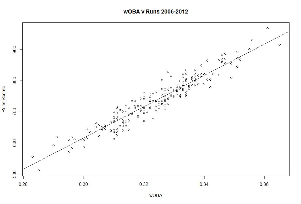
Let’s do something very simple to understand the power of OBP vs AVG. I took each team’s seasons from 2006-2012 and compared their runs scored to AVG and OBP. The correlation is much stronger for OBP than AVG. For batting average the adjusted R squared is .612. For OBP, it’s .7738. In other words, you can explain 61% of the variation in runs scored with batting average and 77% of the variation in runs scored with OBP. OBP is more highly correlated with scoring runs than batting average. Why wouldn’t you want to look at stats that better predict scoring? Here it is in graphical form (the vertical axes are the same):

If you’re interested in going further, take a look at wOBA, because wOBA’s adjusted R squared is .9077, which is a lot better. wOBA tells you more about runs scoring than AVG and even more than OBP. Here it is in graphical form:
I think one reason people are resistant to OBP is because batting average is imprinted on the DNA of the game. We know that .300 is a good average and that .400 is iconic. You have a really good idea what each batting average means, but to use OBP you have to learn how to properly adjust your expectations. .300 is a good average, but you don’t really know what the equivalent OBP is. I’m going to help with a simple rule.
The 60 Rule. That’s it. Take a player’s OBP and subtract .060 from it to get it on the batting average scale. The average OBP is about 60 points higher and the standard deviations are similar. This rule won’t be perfect if you’re statistically savvy, but it will allow you to easily interpret OBP.
If a player has a .390 OBP, just drop 60 points and that is essentially as good as a player who hits .330 using batting average. So David Wright’s average last year was .306, but in reality, he was better than that because of his above average walk rate. He’s more like a .330 hitter than a .300 hitter when you factor in the walks if you choose to think in terms of the batting average scale you learned growing up.
If you’re interested in new stats, we have plenty of info in our Stat Primer page, but the key takeaway here is that little steps are important. OBP is telling you exactly what you think batting average should. It’s telling you how often someone gets on base, while batting average tells you how often they get on base when they get a hit in trips to the plate in which they didn’t walk. Which one makes more sense when you put it like that?
Take a look at OBP next time you scan the stats. It’ll help you understand the game a lot better. Ask questions and be curious. If you don’t agree with a statistic, ask yourself why. Think critically. Look at every stat, but OBP is where you should look if you’re interested in the concept batting average is going after.
