
About two weeks ago I wrote a piece explaining how Verlander’s troubles this season can be chalked up to his inconsistent release point. You can read the entire thing here, in which I lay out the problem in the results, the causes of those problems, and the root cause – release point – that is behind the whole thing. I’ll trust that you’ll believe me or go back and read that piece so I don’t have to repeat myself here.
It’s August 6th and Verlander just twirled 8 excellent innings against the Indians and the initial thing that will catch your eye is his increased fastball velocity (average 96.9, top 100.8). But as you know, I’m not interested in the velocity issue, I’m interested in his release point. So how’d it look?
First, let me show you full season graphs from 2012 and 2013 to get you up to speed on what we’re looking for (from catcher’s perspective):


The difference is obvious. In the initial post I isolated it by pitch type, but let’s just keep it going. You’ll notice our goal is to keep everything to the left of the imaginary -1.5 line. You want the data points between -2.5 and -1.5. That’s the sweet spot. Also between 6 and 7 feet vertically, but that hasn’t been an issue this year.
How’d he do tonight?
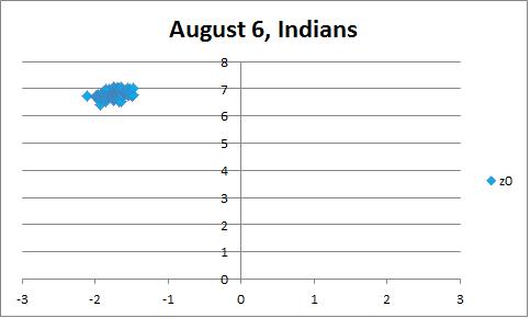
First allow me to apologize for using a different plotting source. The graphs above are from FanGraphs, which won’t update until tomorrow. Below is from Brooks Baseball. I’ll make two notes. One, I’ve looked at the actual numbers from the source and they confirm the graphic. Two, I’ve drawn in the lines of interest because I’m a super helpful guy.

The danger zone is empty. If you look at the source data, there are a couple points that are technically less than an inch over the -1.5 line, but the first two graphs aren’t super precise, so that’s not an issue. I would also like to point out, that thanks to reader suggestion, I checked to see if the Cleveland Pitch F/X setup could be influencing these results. Comparing Sanchez’s start on Monday compared to his last start at Comerica Park showed no systemic bias. In fact, if anything, my exploration of other Sanchez starts indicates that the Cleveland setup might actually be working against Verlander in the example I’m about to show you. I’m not going to wager my life savings on this, but JV’s improvement seems to be showing up despite any sort of technical issues.
If you take a look at the movement charts, there is still room left to improve. The curveball had nice depth, but it needs more horizontal tilt. That said, the velocity is up and the release point looks great. I’m encouraged. The process was good and the results were there against a very good offense. Want more evidence? Below I’ve done the plotting myself for consistency. The first is a terrible start against the worst offense in the AL, the second is tonight against the very good Indians:

Need I say more?
Guys, I think he’s back. The American League is on notice. (Editor’s note: The velocity and release point gains carried into his next start. Details here)

[…] And he can fix it. Heck, Scherzer has a way more complicated motion and he’s repeated that like a champ so far this season. It’s going to be okay Tigers fans, the ace isn’t fading, he’s just going through a bit of a rough patch. And he can find a way to fix it. (Here’s a post from August 6th, showing improvement!) […]
Hi Neil, I’ve been getting acquainted with your work recently – good stuff!
I thought I’d just make a couple of comments here. You may already know these things but if not, they may be useful to you going forward. The first is that release point data from PITCHf/x is *very* tricky. PITCHf/x measures the position of the ball starting from around 40 feet from home plate until around 10 feet from home plate. The exact numbers are stadium-dependent, based on camera locations among other things. The “release point” is actually an extrapolated value from a best fitting of the pitch based on the measurements. It is probably extrapolated back to 50 feet in the Fangraphs data, but definitely 55 feet in the Brooks data, as you can see from the image. So you may not be comparing apples to apples here. Also, when looking at data from an individual game, there are some sanity checks that might be useful to perform, to make sure the changes aren’t just an artifact of the PITCHf/x setup from that night in that stadium. Dan Brooks reported Cleveland’s gun has been typically 0.6 MPH faster than normal this season. I don’t know if the movement/release points tend to be different too, but something simple you can try is checking a couple of other pitchers who pitched last night, and see how their velocity/movement/releases look compared to seasonal averages. Also, on release points specifically, it is possible a pitcher just moves on the rubber to generate different horizontal release points, especially if the vertical release is still the same height. Maybe you could see this in video.
These are not meant to shoot down your thoughts here, as chances are there is something real to your observations. I’m just playing “devil’s advocate” here, pointing out some potential root causes for some of your observations that you may not have considered.
Keep up the good work! I’m enjoying it!
Jon, thanks for the feedback. I’m certainly aware of the Pitch F/X uncertainty, but it’s the best data we’ve got so it’s all I can present. Couple of quick comments. First, if the pitcher is moving on the rubber, I would say that is a meaningful difference in their mechanics, so it’s extremely relevant. Second, the difference in plotting sources is important, but there looks like a real effect when getting to compare everything. If you look at Brooks from 2012 and 2013, the pattern is the same as what I present on FanGraphs. The overall issues is pretty consistent.
The individual game thing is certainly a good point and comparing against other pitchers is very good idea going forward to verify the validity of the stadium setup. FWIW, I’ve been watching him very closely on video and I feel confident about what I see. Unfortunately I’ve yet to master GIFs, so I can’t incorporate video into the post.
I just checked Anibal Sanchez from the night before against his previous start in Comerica Park and it doesn’t look like the Cleveland setup is influencing the release point plotting. I’ll add that in.
Cool. Yes I’m sure you’re watching the Tigers a lot, so I trust your observations. These were just thoughts that crossed my mind as other potential reasons for some of the differences in the images, without having watched these games. I would agree that a move on the rubber can be noteworthy, but it is interesting to differentiate that from a different arm slot if it is possible, which is hard to do I realize without the video. Nice work again Neil!
[…] It’s unclear where to start, so let’s just lay it all out. Justin Verlander (25 GS, 158.2 IP, 3.57 ERA, 3.40 FIP, 3.5 WAR) gave up 4 runs in 7 innings, but had a very nice afternoon courtesy of a good fastball and excellent curveball that yielding just 1 walk and induced 9 strikeouts. Verlander gave up two solo homeruns which barely cleared the short fences at Yankee Stadium and would have been easy outs in more parks, so I certainly won’t hold that against him when attempting to discern performance from statistics. The signs were all good regarding his road back to dominance as his average fastball registered 95.3 mph and his release point was in line with his most recent start. […]
[…] And How He Fixed It […]