The 2013 Tigers Are (Almost) The Best Rotation Ever

In mid-June I wrote that the Tigers’ starting rotation was on pace to be the best starting staff in MLB history by Fielding Independent Pitching (what’s FIP?) which is a statistic that measures the three true outcomes a pitcher has complete control over and scales it to look like ERA. Based on strikeouts, walks, and homeruns – the Tigers are on pace for an historic season.
If you don’t know much about FIP, click on the link above to see why it’s a better reflection of a pitcher’s true talent than ERA which depends a lot on the defense behind the pitcher. Another statistic, Expected Fielding Independent Pitching (xFIP), considers a pitcher’s GB/FB rate and averages out their HR/FB%, but unfortunately we don’t have batted ball data before 2002. We have FIP data all the way back to the beginning of MLB history. If we start in 1901 and run through Saturday, the Tigers have the third best FIP of all time. What I’m about to show you is FIP-, which is simply FIP adjusted for park effects and league average which allows us to compare teams in different run scoring environments. 100 is league average and a point above or below is a point better or worse than average. A FIP- of 95 is 5% better than average. Here are the top five FIP- in MLB history:
| Rank | Season | Team | FIP- |
| 5 | 1996 | Braves | 78 |
| 4 | 1997 | Braves | 78 |
| 3 | 2013 | Tigers | 78 |
| 2 | 2011 | Phillies | 77 |
| 1 | 1971 | White Sox | 77 |
Two months ago, the Tigers had a starting rotation FIP- of 64, and they’ve since come back to the pack because that would have been a crazy good number. Despite struggles from Verlander and a few bad starts from Fister, the Tigers still have the 3rd best rotation in MLB history.
They are getting contributions from everyone in the rotation, too. Here are a series of tweets I send out Saturday night about the Tigers rotation:
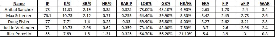
The rotation is deep. Here are some basic numbers:
| Name | IP | WAR | ERA- | FIP– |
| Anibal Sanchez | 111 | 3.7 | 63 | 61 |
| Max Scherzer | 151.1 | 4.5 | 70 | 67 |
| Doug Fister | 143 | 3.1 | 86 | 80 |
| Justin Verlander | 143.2 | 3.1 | 95 | 84 |
| Rick Porcello | 110.1 | 2.0 | 111 | 86 |
| Jose Alvarez | 19.2 | -0.2 | 123 | 147 |
Only Alvarez (and his 20 IP) has a FIP that isn’t at least 14% better than average and all of the main five starters have at least 2.0 wins above replacement or more (what’s WAR?). In fact, despite having an ERA a bit worse than their FIP due to some less than perfect defense behind them, the Tigers rank very well in both all time.

More teams have allowed fewer runs relative to average, but only two teams have ever done so thanks to better pitching. The Tigers aren’t a lock to set this record, but they are pitching very well right now and are currently hanging right around the strikeout rate record as well.
The Tigers are a good team top to bottom with a great offense, but their starting pitching is the flashy component. They have baseball’s best offense and best pitching staff – and the pitching staff might be one of the best all time. I’ve written a lot about the different Tigers starters and what makes them great this season. You can find every one of those pieces in our Tigers Breakdowns section along with a piece about how the Tigers are utilizing the changeup as a weapon more and more.
With 53 games to play, the Tigers are not in position to break the all-time record for FIP, but they are just 1% away from the top mark in history. With just a little better performance than they are on pace for, the Tigers could be the first team to ever have their starting staff pitch 26% better than league average for an entire season. It’s a remarkable record and one that isn’t nearly well-known enough.
National and local writers have made plenty out of the very good Tigers rotation, but with the exception of a piece by Dave Cameron at FanGraphs, I haven’t seen anyone else call attention to just how great this rotation truly is. The Tigers aren’t just pitching pretty well this season, they’re pitching better than all but two rotations in baseball history spanning more than 100 seasons.
With about two months left, this is going to be fun to watch.
The 2013 Tigers Are The Best Rotation…Ever (So Far)
Regular readers will not be surprised to hear me say the Tigers rotation is exceptional and many of you have probably seen Dave Cameron’s take from a few weeks ago on the same subject. His point, which is the one I’ll pick up here, is that when we adjust Fielding Independent Pitching (FIP) for ballpark effects and league average, the Tigers have the best rotation ever, no hyperbole added.
Those adjustments will look like this: League average FIP- is 100 and every point above or below average is a percent better. Pitchers want the lowest FIP- possible.
The current record for FIP- belongs to the 1971 White Sox at 77 with a handful of other clubs packing around 77-79. The 2013 Tigers are setting the pace, however, at 64. Consider what that means. The best rotation of all time was 23% better than league average. The Tigers rotation is 36% better than league average.
Certainly, the season isn’t even half over and there is time for the Tigers to cough this up, but they have a pretty big cushion. They’re getting contributions from all five starters who all have a FIP below 3.50 and all have xFIPs at 3.20 or below. More amazingly, the strikeout rate is off the charts. We have to acknowledge that this is a high strikeout era, but the Tigers current K/9 from the starting rotation is 9.51. The MLB record is 8.62 from the 2003 Cubs. The Tigers have a K:BB ratio of 4.46. The MLB record is 4.22 from the 2011 Phillies.
The Tigers rotation leads baseball in K/9 by a ton, is 3rd in BB/9, and 2nd in HR/9. They’re essentially dominating hitters in a way that we’ve never seen before. Currently, they’ve accumulated 13.2 WAR, which is 3.3 wins more than the 2nd place Cardinals and they are nearly halfway to the record set by the 1970 Cubs (29.4).
It’s a rotation on an historic pace. If we plot FIP- and ERA- (which is the same principle comparing to league average) it just looks silly. This is every starting rotation in MLB history, including the other 2013 rotations who are already regressing to the mean.

One would except the Tigers to regress toward the line that obvious runs through this plot, but it’s not entirely clear in which direction they will move. FIP and xFIP are more predictive than ERA, so you would expect that they would move left on the graph before they moved up, but that seems equally ridiculous given a subpar defense and the fact that an ERA- that low would also be silly.
I’ve written before about how the Tigers as a team are throwing more changeups and how Scherzer, Porcello, and Sanchez have all made leaps into the upper echelons of MLB starters. This is a truly remarkable rotation that Dave Dombrowski has assembled. Most teams would kill for their worst starter. Their fourth best starter would be the ace on almost every team this season. They have the 4th, 6th, 8th, and 11th best pitchers by WAR this season. They have the 2nd, 7th, 8th, and 12th best starters by FIP and the five Tigers starters are 4th, 6th, 7th, 8th, and 16th best pitchers by xFIP in MLB right now.
If you sort AL starters by xFIP all five Tigers starters are in the top 10. Three of the top four AL starters in K/9 are Tigers. Justin Verlander has the Tigers worst BB/9. Justin Verlander.
This is, perhaps, the most incredible rotation we’ve ever seen. If you look at the individuals starters and how they compare to their peers you certainly have to wonder where the Tigers rank all-time. As it turns out, they rank quite well. By strikeouts, walks, and homeruns allowed, the three categories that build FIP, pitchers have complete control over, and generally predict future performance, the 2013 Tigers are not just the best rotation we’ve ever seen, it’s not really even that close.
With 95 games to play, the Tigers staff is working on a season for the ages.
Stat of the Week: Expected Fielding Independent Pitching (xFIP)
Generally, I’ve been a little light on “weekly” updates to this feature, but I generally write at least one statistically informative post a week, even if it doesn’t actually follow the mold I’ve laid out. Today, I’ll try to write that wrong with an introduction to the very useful Expected Fielding Independent Pitching (xFIP).
You may recall my introduction to Fielding Independent Pitching (FIP) some months ago and my frequent use of the metric on the site. You can read my introduction to FIP or Fangraphs’ primer to catch up, but I’ll outline the basic concept because it carries over.
We use FIP because ERA is not a reflection of a pitcher’s individual performance because he cannot control what his defense does once the ball is put in play. Two pitchers who are carbon copies of each other will perform differently if you put them in front of the Dbacks defense (currently the league’s best) and the Angels defense (one of the league’s worst so far) despite throwing identical pitches to identical hitters. ERA is a reflection of the team as a whole, not just the pitcher.
In steps FIP or a class of numbers coming from this idea, to measure a pitcher’s performance based only on what we know he can control. FIP takes strikeouts, walks, and homeruns and uses historic run values to calculate a number on the same scale as ERA so that you can see which pitchers are succeeding in the areas of the game they can control. Generally speaking, defense evens out over a long enough period and ERA, FIP, and our new friend xFIP will converge toward each other.
The FIP formula looks like this:
FIP = ((13*HR)+(3*(BB+HBP))-(2*K))/IP + constant
So what exactly is xFIP? xFIP, as you can read about on Fangraphs, takes this one more step. xFIP is the same as FIP except it normalizes HR/FB rate to give you a number that better predicts future performance.
It’s actually pretty simple, just stay with me. Generally speaking, we’ve found that the percentage of a pitcher’s flyballs that are hit for homeruns will converge toward about 10% and that large variations from that number are not sustainable. If you allow more flyballs, you’ll allow more homeruns, and that will cost you in FIP and xFIP, but if you’re allowing half of your flyballs to go for homeruns, it’s likely that won’t happen for very long.
So xFIP looks like this:
xFIP = ((13*(Flyballs * League-average HR/FB rate))+(3*(BB+HBP))-(2*K))/IP + constant
As you can see, it’s the same formula, but it takes your flyball rate and multiplies that by the league average HR/FB rate to get a more predictive version of your HR rate going forward. xFIP is one of the best indicators of future performance we have and it is very useful in evaluating which pitchers are getting lucky and which pitcher’s are actually performing in line with their skills.
If we scan the Tigers 2013 leaderboard right now (digits truncated), you can get a sense of how this works. As expected, all of the Tigers have better FIP than their ERA because they play in front of a poor defense, but all of their xFIP are slightly higher than their FIP (except for Porcello) because they are allowing a lower than average HR/FB rate. Porcello, on the other hand, has very unlucky 21% HR/FB rate, so his xFIP is better than his FIP. Again, xFIP correlates better with future performance than almost any other ERA estimator.
Personally, I like to look at FIP to see how a pitcher is doing and use xFIP to see how fluke-y his homerun rate is. They’re both good metrics and they are both better indicators of individual performance than ERA.
Want to learn about a statistic? Request one for the next edition in the comments section or on Twitter @NeilWeinberg44. If you’re looking to catch up on sabermetrics, check out New English D’s posts on FIP, WAR, wOBA, wRC+, and ISO.
On Defense and Unearned Runs: ERA Isn’t the Answer
Last night, Justin Verlander was not at his best, but his overall line looked worse than it was because Torii Hunter made two poor plays in right that cost Verlander two runs, but neither was ruled an error. So Verlander’s ERA goes up because of poor defense even though conventional wisdom is that the “earned” part of ERA factors out your defense making mistakes behind you.
It does and it doesn’t. You don’t get charged for runs that come from errors but you do get penalized when the official scorer makes a mistake (as we saw last night) and when your defensive players do not make a play they should have even though it does not qualify as an error. Sabermetricians have devised other metrics like FIP, xFIP, SIERA, and others to stand in for ERA with a focus on elements of the game that pitchers can control because they have no control of what happens once contact is made. (Read my explanation of FIP for more specific information)
Today, I’d like to offer a little concrete evidence for why ERA doesn’t capture a pitcher’s value. Let’s take an independent measure of defense (Fangraph’s aggregate Fld score) and compare it to the number of unearned runs a team allows (or the percentage of a team’s runs that are unearned).
I haven’t looked back into history, but for 2013 the relationship is nonexistent. For the raw number of unearned runs, the results are not statistically significant and are substantively small. On average a team needs to increase its Fld score (range -21 to 18 so far) by about 7 to eliminate a single unearned run on average (range 5 to 25 so far). On average, from worst to first in Fld you can move only 20% of the range of unearned runs. This tells us that the strength of one’s defense does not predict the number of unearned runs allowed. The results are the same if we control for the total number of runs a team has allowed.
Here it is in graphical form:

As you can see, the number of unearned runs has almost no relationship with Fld and if you squint hard enough can only come up with the slightest negative tilt. Basically, what this is showing you is that the difference between your runs allowed and the runs you get shoved into your ERA do not depend on the quality of your defense, it depends on the official scorer and it depends on a lot of other things that have nothing to do with a pitcher’s skill or performance.
This is all by way of saying that ERA is not a good measure of a pitcher’s true skill level. It’s not a bad place to start, but if you look at the Won-Loss Record and ERA, you’re getting very little useful information. Expand your horizon to K/9, BB/9, HR/FB, FIP, xFIP, and other statistics and metrics that enrich the game.
ERA attempts to capture the pitcher’s performance in isolation but it doesn’t. The defense and the official scorer play huge roles in determining that number. If you want to judge a pitcher by themselves, you need to look deeper.
If you’re interested in learning more, I encourage you to visit the Fangraphs Glossary or to post questions in the comment section. I’d be happy to explain or interpret any and all statistics about which you are curious.
The Greg Maddux Way: A Simple Statistic
The great Greg Maddux (355-227, 3.16 ERA, 3.26 FIP, 114.3 WAR) once said the key to pitching is throwing a ball when the batter is swinging and throwing a strike when the batter is taking. That’s a pretty good general rule, but an astute observer would certainly recognize that a pitcher isn’t really equipped to predict such a thing terribly well.
But this did get me thinking, is there something to this idea despite other intervening reasons that confound it? Certainly, if you have a crazy slider that no one can hit, it doesn’t really matter where you throw it. Or a fastball that the hitter can’t handle. It’s also not like where you choose to throw the pitch and if the hitter swings are independent of each other.
So this is an exercise, plain and simple. The Maddux idea is a good one in principle, but it’s not that simple. We know that, he knows that, let’s just look into it for fun.
I drew from the 2012 season and looked at qualified pitchers (n = 88). I developed a simple statistics to quantify how Maddux-y they pitched.
mPercentage = (O-Swing% – League Average O-Swing%) + (-1)*(Z-Swing%-League Average Z-Swing%)
O-Swing% is the percent of the time a pitcher induced the opposing hitter to swing at a pitch he threw outside the zone and Z-Swing% is the same statistic for pitches inside the zone. The -1 is included so that both Maddux attributes are positive and can be added together without converging toward zero.
The results were pretty surprising because some pitchers at the top of the list are awesome and some are average and some are terrible. There isn’t a ton of correlation between this statistic and actual production. The two league leaders in 2012 mPercentage are Joe Blanton and Chris Sale. Cliff Lee is 4th, which sounds right, but Verlander is 42nd.

If you take a wider angle and regress ERA or FIP on mPercentage, you find that on average a 1% increase (i.e. 5% to 6%) decreases your ERA or FIP by 0.06 runs, which is not very much at all. mPercentage is statistically significant in both models, but not substantively significant at all. (The R squared is less than .11 in both.)
So what this tells us is that the Maddux Method doesn’t really exist in practice. Pitchers who induce swings on balls and takes on strikes are no more successful than those who do not. However, there is a obviously a two-way street at play here like I mentioned earlier. The Maddux Method works perfectly in theory, but we have an observation issue given that Justin Verlander’s strikes are much harder to hit than Joe Blanton’s, so he can throw more of them.
I like the Maddux philosophy of pitching, but it isn’t enough. You also need to have good stuff.
Justin Verlander Conquers April (with graphs!)
This particular pitcher, Justin Verlander, is widely considered to be one of the best in baseball. You may disagree with that statement, but he’s certainly one of the very best pitchers in the entire league. Yet he has become the game’s best without doing very well in the season’s first month over the course of his career. Even in his Cy Young/MVP season, his April ERA was 3.64. In 2009, it was 6.75!
It’s been a bit of a thing among Tigers fans that Verlander isn’t that good in April. But he’s getting better and that should probably terrify you if you are a major league hitter.
Let’s take a look at his ERA and FIP in April across his career:

There was a time in which Verlander allowed a lot of runs in April and pitched in a way that suggested he would allow runs. ERA tells you what happened, FIP tells you what generally happens to pitchers who pitch a certain way. But over the last few years, he’s conquered April. His 2013 April ERA was 1.83. Imagine what he can do this season now that he isn’t trying to play catch up.
This trend is evident in his K/9 and BB/9 numbers as well:

Verlander has made noticeable improvement in April walk rate over the last few seasons and the strikeout rate hasn’t suffered.
Now maybe Verlander won’t take this great April and turn it into a season better than 2009 or 2011 or 2012, but he very easily could. If he continues his pattern of pitching better in the summer months, then we may be in for a treat. Verlander, I would argue, is nowhere near the top of his game so far this year, but he’s getting good results. When he settles in, it could be awesome.
He’s the richest pitcher in history and his teammates are putting pressure on him to match their great start. Justin Verlander has usually stumbled through April, but he did not do so in 2013. Could this be Verlander’s career year? If April is any indication, clear your calendar for every fifth day and start thinking about a trip to Cooperstown in about 15 years.
Stat of the Week: Fielding Independent Pitching (FIP)
One of the things I want to try to do here at New English D is to introduce sabermetrics into the common vernacular of baseball fandom. I think the biggest reason for resistance to new stats and metrics is that they are not commonly understood. It’s not because people are too stupid, they just simply aren’t looking to spend a lot of time learning new things that don’t seem relevant.
Basically, most baseball fans don’t really understand why the basic statistics are misleading them about a player’s true value.
I’d like to start with one of the more prominent sabermetrics for pitchers, Fielding Independent Pitching (FIP) which is essentially a stand in for Earned Run Average (ERA).
The problem with ERA is that so much of it is outside of a pitcher’s control. For example, if you have a terrible defense, your ERA is going to be higher than if you have an awesome defense, even if you make identical pitches for an entire season.
What FIP tries to do is factor defense out of the equation by presenting a formula that predicts what your ERA would be if you had league average defense and league average luck by looking at your strikeouts, walks, and homeruns allowed (things you can actually control as a pitcher). Generally speaking, the most contact hitters make against you, the more variation we could see.
The formula goes something like this and is based on long run averages in MLB history:
FIP = (13 x HR) + (3 x (BB+HBP)) + ((2 x K) / IP) + constant
What this formula does is give you a number that looks like ERA, but only responds to things inside a pitcher’s control and FIP is a better predictor of future performance than ERA. Generally speaking, it’s a great place to start your analysis. You want to dig deeper into batted ball data and other trends, but FIP starts you off with a number that is based solely on a what a pitcher can control.
For reference, an average FIP is 4.00 with an excellent one being 2.90 and a terrible one being 5.00. For a full explanation from the people who created it, see this.
To give you an idea, let’s take a look at the some ERA to FIP comparisons from the 2012 season. For a complete listing of FIP, head here.
MLB’s top five in FIP this year were Gio Gonzalez (2.82), Felix Hernandez (2.84), Clayton Kershaw (2.89), Justin Verlander (2.94), and David Price (3.05). That seems to jive with what you might think. Remember Gio and Kershaw get to face the pitcher, so their number is going to look a little better just like ERA.
So of the qualifying starts in 2012, whose ERA made them look better or worse than they are?
I’m picking a few examples to demonstrate FIP’s usefulness. Tigers’ sinkerball Rick Porcello seems an obvious candidate for an ERA inflated by bad defense, right? Very true. Porcello’s ERA is a robust 0.68 runs higher than his FIP. The Royals Luke Hochevar didn’t get much help either with an ERA a whopping 1.10 runs higher than his FIP.
How about guys whose ERA made them look better than they are? Jeremy Hellickson got a full 1.50 runs back from his defense per nine innings and extreme fly ball pitcher Jered Weaver, with the help of the crazy good Angels outfield, got 0.94 runs better in ERA than FIP.
Now four random examples might not convince, but I encourage you to take a look at the FIP leaders and start using that metric to learn a little bit more about how someone is pitching.
Two final thoughts. One don’t bother with RA Dickey because there are so few knuckleballer’s in history and the averages don’t control for how differently knuckleballs get hit.
Two, whose defense and luck has been the most average so as to keep their FIP in line with their ERA this year? That award goes to the Pirates’ James MacDonald who posted an ERA and FIP of 4.21, making him the only player to have both numbers equal.
Come back next week for another Stat of the Week and feel free to suggest some that you would like to learn about.
