The Nine Worst 20 Win Season in MLB History

To regular readers it will come as no surprise that I’m part of the movement to remove the pitcher won/loss record from our baseball evaluations. I’ve written on the subject quite a bit, both with respect to individual seasons and entire careers, and this piece seems like a perfect fit to round out the discussion. It also helps that I got a direct request for this exact thing after I posted yesterday’s piece:
So what follows are The Nine Worst 20 Win Seasons in MLB history. It gets a little tricky to draw lines here, so let me give you a quick primer. I don’t want this post to be about pitchers who made a lot of starts so they got a lot of wins, but rather about pitchers who performed poorly and still got wins. Therefore, instead of using Wins Above Replacement as I did for the under 9 list, I will be using ERA- and FIP-, which are simply statistics that calculate the difference between a pitcher’s ERA or FIP and league average during that year. Also it controls for park effects, but it’s basically a way to compare an ERA from the deadball era to one from the steroid era.
I would personally prefer to see this done with FIP-, because it better reflects a pitcher’s skill, but I’m going to use ERA- as well so that this piece is more convincing. A pitcher who allows a lot of runs shouldn’t win a lot of games, and you should agree with that if you’re old school or new school.
Additionally, I’ve included lists from 1901-2012 and just 1945-2012 if you’re concerned about the number of starts inflating someone’s win total. That’s fair, so I’ve broken it down into four separate lists, all telling you the same thing. You can have a bad year and win 20 games. 20 games is the old school gold standard of performance, so this cutoff makes sense. If you’ll recall, there have been more than 8,000 qualifying seasons in MLB history and if you try to predict WAR, ERA, or FIP with wins, you get an adjusted R squared of less than .40 in all cases. This isn’t just about a few examples, it’s about the entire population of starting pitchers. For more on this, read the two links above and check out the bottom of this piece.
Here we go.
1945-2012 by ERA-
| Rank | Season | Name | Team | W | L | IP | ERA- |
| 9 | 1950 | Johnny Sain | Braves | 20 | 13 | 278.1 | 100 |
| 8 | 1965 | Sammy Ellis | Reds | 22 | 10 | 263.2 | 101 |
| 7 | 1973 | Paul Splittorff | Royals | 20 | 11 | 262 | 102 |
| 6 | 1971 | Steve Carlton | Cardinals | 20 | 9 | 273.1 | 103 |
| 5 | 1970 | Jim Merritt | Reds | 20 | 12 | 234 | 104 |
| 4 | 1980 | Joe Niekro | Astros | 20 | 12 | 256 | 106 |
| 3 | 1972 | Stan Bahnsen | White Sox | 21 | 16 | 252.1 | 113 |
| 2 | 1959 | Lew Burdette | Braves | 21 | 15 | 289.2 | 113 |
| 1 | 1966 | Denny McLain | Tigers | 20 | 14 | 264.1 | 113 |
1945-2012 by FIP-
| Rank | Season | Name | Team | W | L | IP | FIP- |
| 9 | 1971 | Dave McNally | Orioles | 21 | 5 | 224.1 | 110 |
| 8 | 1967 | Mike McCormick | Giants | 22 | 10 | 262.1 | 110 |
| 7 | 1959 | Lew Burdette | Braves | 21 | 15 | 289.2 | 111 |
| 6 | 1990 | Bob Welch | Athletics | 27 | 6 | 238 | 112 |
| 5 | 1958 | Bob Turley | Yankees | 21 | 7 | 245.1 | 112 |
| 4 | 1979 | Joe Niekro | Astros | 21 | 11 | 263.2 | 114 |
| 3 | 1967 | Earl Wilson | Tigers | 22 | 11 | 264 | 114 |
| 2 | 1973 | Catfish Hunter | Athletics | 21 | 5 | 256.1 | 122 |
| 1 | 1966 | Denny McLain | Tigers | 20 | 14 | 264.1 | 123 |
1901-2012 by ERA-
| Rank | Season | Name | Team | W | L | IP | ERA- |
| 9 | 1910 | George Mullin | Tigers | 21 | 12 | 289 | 109 |
| 8 | 1914 | Christy Mathewson | Giants | 24 | 13 | 312 | 110 |
| 7 | 1911 | Jack Coombs | Athletics | 28 | 12 | 336.2 | 110 |
| 6 | 1906 | Christy Mathewson | Giants | 22 | 12 | 266.2 | 112 |
| 5 | 1972 | Stan Bahnsen | White Sox | 21 | 16 | 252.1 | 113 |
| 4 | 1919 | Hooks Dauss | Tigers | 21 | 9 | 256.1 | 113 |
| 3 | 1959 | Lew Burdette | Braves | 21 | 15 | 289.2 | 113 |
| 2 | 1966 | Denny McLain | Tigers | 20 | 14 | 264.1 | 113 |
| 1 | 1903 | Henry Schmidt | Superbas | 22 | 13 | 301 | 118 |
1901-2012 by FIP-
| Rank | Season | Name | Team | W | L | IP | FIP- |
| 9 | 1911 | Bob Harmon | Cardinals | 23 | 16 | 348 | 114 |
| 8 | 1921 | Joe Oeschger | Braves | 20 | 14 | 299 | 114 |
| 7 | 1967 | Earl Wilson | Tigers | 22 | 11 | 264 | 114 |
| 6 | 1903 | Henry Schmidt | Superbas | 22 | 13 | 301 | 114 |
| 5 | 1906 | Jack Taylor | – – – | 20 | 12 | 302.1 | 115 |
| 4 | 1910 | George Mullin | Tigers | 21 | 12 | 289 | 117 |
| 3 | 1908 | Nick Maddox | Pirates | 23 | 8 | 260.2 | 121 |
| 2 | 1973 | Catfish Hunter | Athletics | 21 | 5 | 256.1 | 122 |
| 1 | 1966 | Denny McLain | Tigers | 20 | 14 | 264.1 | 123 |
And now, to bring the point home even further, let’s put an innings cap at 210 and take a look at 15+ win seasons since 1945 by ERA-
| Rank | Season | Name | Team | W | L | GS | IP | ERA | FIP | WAR | FIP- | ERA- |
| 9 | 2003 | Ramon Ortiz | Angels | 16 | 13 | 32 | 180 | 5.2 | 5.26 | 0.9 | 119 | 117 |
| 8 | 1983 | Eric Show | Padres | 15 | 12 | 33 | 200.2 | 4.17 | 4.37 | 0.3 | 121 | 118 |
| 7 | 1989 | Storm Davis | Athletics | 19 | 7 | 31 | 169.1 | 4.36 | 4.4 | 0.5 | 123 | 119 |
| 6 | 2004 | Shawn Estes | Rockies | 15 | 8 | 34 | 202 | 5.84 | 5.54 | 1 | 112 | 120 |
| 5 | 1966 | Dave Giusti | Astros | 15 | 14 | 33 | 210 | 4.2 | 3.57 | 2.6 | 105 | 120 |
| 4 | 1999 | Kirk Rueter | Giants | 15 | 10 | 33 | 184.2 | 5.41 | 5.01 | 1.1 | 113 | 124 |
| 3 | 1989 | Andy Hawkins | Yankees | 15 | 15 | 34 | 208.1 | 4.8 | 4.44 | 1.2 | 117 | 124 |
| 2 | 1969 | Steve Blass | Pirates | 16 | 10 | 32 | 210 | 4.46 | 3.72 | 2 | 109 | 126 |
| 1 | 1980 | Dan Spillner | Indians | 16 | 11 | 30 | 194.1 | 5.28 | 4.45 | 1.4 | 110 | 130 |
And now again with FIP-
| Rank | Season | Name | Team | W | L | G | GS | IP | ERA | FIP | WAR | ERA- | FIP- |
| 9 | 2012 | Barry Zito | Giants | 15 | 8 | 32 | 32 | 184.1 | 4.15 | 4.49 | 0.9 | 110 | 120 |
| 8 | 1983 | Eric Show | Padres | 15 | 12 | 35 | 33 | 200.2 | 4.17 | 4.37 | 0.3 | 118 | 121 |
| 7 | 1984 | Eric Show | Padres | 15 | 9 | 32 | 32 | 206.2 | 3.4 | 4.23 | 0.7 | 97 | 122 |
| 6 | 1963 | Phil Regan | Tigers | 15 | 9 | 38 | 27 | 189 | 3.86 | 4.58 | 0 | 104 | 123 |
| 5 | 1989 | Storm Davis | Athletics | 19 | 7 | 31 | 31 | 169.1 | 4.36 | 4.4 | 0.5 | 119 | 123 |
| 4 | 1975 | Jack Billingham | Reds | 15 | 10 | 33 | 32 | 208 | 4.11 | 4.43 | 0.4 | 114 | 124 |
| 3 | 2006 | Steve Trachsel | Mets | 15 | 8 | 30 | 30 | 164.2 | 4.97 | 5.5 | 0.1 | 114 | 125 |
| 2 | 1971 | Chuck Dobson | Athletics | 15 | 5 | 30 | 30 | 189 | 3.81 | 4.19 | 0.1 | 117 | 126 |
| 1 | 1950 | Tommy Byrne | Yankees | 15 | 9 | 31 | 31 | 203.1 | 4.74 | 5.51 | 0.5 | 107 | 128 |
Even when we limit the number of innings a pitcher throws, pitchers can still accumulate wins despite pitching much worse than league average.
So whether you like the simple and easy ERA or the more predictive and true FIP, here you have plenty of evidence that winning a lot of games doesn’t mean you had a good season. Guys on this list were 10 and 20% worse than league average in these seasons and still won the magic 20 games. This is further proof that wins do not reflect a pitcher’s individual performance.
You can be worse than average and still win at an elite level. Last week I showed how you can be much better than average and win fewer than 10 games. Yesterday, I showed that this isn’t a small sample size, single season trick. This is true in small samples and in large samples.
Here’s a quick look at every individual season in MLB history again up against ERA-. There is a trend, but the variation is huge. The adjusted R squared is .3046, meaning wins can only explain 30% of the variation in ERA relative to league average.

FIP- actually makes wins fare worse, at .1709 adjusted R squared. I won’t bother showing the graph because this one makes the point just fine. You can have an all time great season at run prevention and win 10 games and you can have a well below average season and win 20. Wins are about many factors and pitching is just one of them. You can have a great outing, great season, and great career and never get the wins you deserve and the exact opposite is true as well.
It’s time to outgrow the win and start talking about things that actually measure performance. Even if it’s ERA, which isn’t even the best way to do things. Let’s look at innings and strikeouts and FIP and WAR and everything else. Wins are the oldest statistic there is but they’ve long since lost their usefulness.
If you’re someone who believes heavily in wins, I challenge you to write a cogent response that defends their use. I’d be happy to publish it if you don’t have your own forum and will respond to your arguments. I want to be someone who helps move sabermetrics from a niche tool to the mainstream and I don’t want this to be about drawing lines between people who love baseball. This is my argument against wins, I hope that you take it to heart and really think about it.
Ask questions, look for evidence, and let’s talk about baseball. Share this with people who love wins and hate them. This shouldn’t be a partisan debate between the new and old, it should be about knowledge and fun. Always.
Stat of the Week: Batting Average on Balls in Play (BABIP)
Batting Average on Balls in Play (BABIP) is one of the most easily understood sabermetric statistics because it can be easily calculated at home like many of the basic descriptive stats, but it is also a very powerful tool. Let’s start with the basic idea (or you can read about it at Fangraphs).
BABIP is exactly what it says it is, a player or pitcher’s batting average (or average against) on balls that are put in play, meaning that strikeouts and homeruns are subtracted from at bats in the denominator while sacrifice flies are added and homeruns are subtracted from the numerator of batting average, it looks like this:
BABIP = (H – HR) / (AB – K – HR + SF)
Sac bunts aren’t included because you’re making an out on purpose, so it doesn’t really belong given that it doesn’t reflect a hitter or pitcher’s skill.
BABIP tells you what percentage of balls hit somewhere the defense could make a play go for hits and can tell us a lot about players. For hitters, defense, luck, and skill determine your BABIP. A good defense playing against you will lower your BABIP because they will catch balls that should be hits, luck will lower or raise your BABIP because sometimes hard hit balls go right at someone, and skill will influence your BABIP because line drive hitters and speedy runners are more likely to have higher BABIPs because they hit the ball in a way that is more likely to result in hits or they leg out infield singles.
We generally think of true talent levels for hitters between .250 and .350 with average being right around .300. If you see someone deviate greatly from .300 or so, there may be a legitimate reason, but it is also very likely about luck. Hitters can influence their BABIP, but BABIP is fluky and takes a while to settle down, meaning that in small samples your BABIP can be quite different from your true talent level. This is what we mean when we say someone’s success is BABIP driven. No one can sustain a .450 BABIP for a whole season, but they can do it for two weeks and that can inflate statistics like batting average and slugging percentage in small samples.
The same is true for pitchers, but it’s even more critical. Pitchers have very little control over what happens to the baseball once it is put in play. Strikeouts, walks, and homeruns rest solely on a pitcher, but once a hitter makes contact it’s out of their hands. Most pitchers will have BABIPs close to .300 and any serious deviation from that number means there is some serious luck or defense involved. Even pitchers who are easy to hit will still have BABIPs closer to average because their defense will still get to a high percentage of balls in play.
Using BABIP is very easy. Hitters can have higher or lower BABIPs based on their skills, but they are unlikely to post very high or very low BABIPs. For example, only 14 hitters in MLB history have BABIPs above .360 for their careers and only 26 hitters since WWII have BABIPs lower than .240. What you want to do is compare a hitter’s season BABIP to their previous seasons to see if it is in line. If you’re jump from a .310 career BABIP to a .360 the next season, it’s likely due for some regression to the mean. BABIP can be predictive like this if there is no underlying change in skill.
For pitchers it’s even better. If a pitcher has a BABIP the deviates heavily from average, it’s almost certainly a function of luck or bad defense.
It’s quite straightforward. If someone’s BABIP deviates heavily from .300 and has no history of a high or low BABIP, it means you’re likely looking at something fluky. Here’s a quick demonstration to prove the point. Here is every qualifying hitter season since 1990 by BABIP:
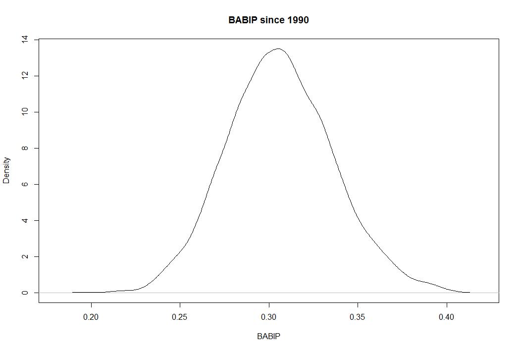
You can see how it centers on .300 and almost never extends beyond .250 and .350. But in small samples, it can be fluky and give you weird results that can inflate your batting average or other numbers. Let’s look at the last 14 days in MLB:

You’ll notice the normalized shape, but also notice the scale across the horizontal axis. Lots of players have BABIPs in the .400 and below .200 over the last two weeks, meaning lots of players are over and underperforming their true talent thanks to luck and random variation.
The takeaway is simple. BABIP is a place to look when deciding if a player’s improved (or worse) results are coming from a real change in skill or good fortune. If the BABIP looks funky, look closer. If the BABIP looks typical, there might be something real going on.
What About Pitcher Wins With A Long Lens?
This season, the debate between those who like using wins to judge pitchers and those who want nothing more than to forget that statistic exists has heated up and we’ve seen the movement heavily publicized by MLB Network’s Brian Kenny, who takes on “wins” on a daily basis.
The argument against using wins is simple. The way pitcher wins are determined does not reflect individual pitcher performance, and therefore is an improper judge of how well someone performed. There are countless examples, most clearly Cliff Lee last season and James Shields and Chris Sale this season. Last week, we took on some of the best seasons ever by pitchers who won 9 or fewer times in a season. So much of what leads to wins is completely out of the pitcher’s control and they shouldn’t be judged based on how many runs their team scored for them. Run support, even if we strip away defense, the opposing pitcher, and dumb luck, is a clear and important factor in how many wins you have.
Last week, I gave you this graph which showed that in the 8,000+ qualifying seasons since 1901, wins did very little to explain overall performance:

But those numbers just reflect single seasons. I started wondering about bigger samples. Pitchers can get really lucky or unlucky in a given start and clearly they can in given seasons, but what about in their careers? Can you fake your way through an entire career of wins? It turns out that you can. Let’s take a look.
Below is a graph of Wins per Start (so as to control for guys who made 400 starts and guys who make 250 starts) and ERA- (which is simply ERA scaled to league average during that era and adjusted for park effects. Lower ERA- is better and 100 is league average, meaing ERA- of 90 is 10% better than average). What you see here is that wins fare no better in career samples than season ones (sample size of 2,155):
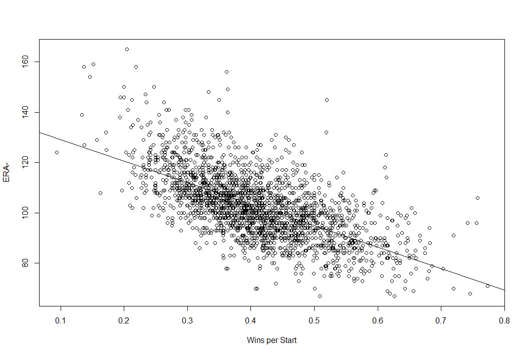
The trend line is clear in that the lower your ERA-, the more frequently you win, but there is significant variation at each point. For example, at a wins per start of 40%, some pitchers have ERA- of 80 and some have ERA- of 120. The adjusted R squared here is .3966, which means that only 40% of the variation in ERA- can be explained by Wins per Start. That’s less than half.
If we used FIP-, which is the scaled version of Fielding Independent Pitching (FIP), the results are even more troubling for wins.

The adjusted R squared here is only .2131, meaning that only about 21% of the variation in FIP- can be explained by Wins per Start. You can win 50% of your starts as the best pitcher of all time or as one of the worst.
The takeaway here is very simple and very important. Your ability as a pitcher to keep the other team from scoring (as seen with ERA-) and your ability to prevent runs based on only that which you can control (FIP-) are not that heavily correlated with winning. You can’t use a pitcher’s wins to predict how good they are because you can win if you prevent runs like a superstar or if you prevent runs like a Triple A long reliever. Even if you strip out defense and the quality of the other offense and give the pitcher credit for every single run he allows, there is still the issue of team run support that he has zero control over.
Last week I provided simple, straightforward evidence for why wins don’t reflect performance over the course of the season, but here I’ve shown that wins don’t even tell you much over the course of an entire career. It’s the job of a starting pitcher to limit the runs they allow, but the ability to limit runs doesn’t correlate very well with how often you win because so much of that is out of your hands.
Wins are not a good measure of individual performance and we should stop using them as such. This isn’t because sabermetricians don’t understand the point of the game, which is to win, but rather because we understand that “wins” as a stat for pitchers tells us nothing about how much they contributed to helping their team win. Pitchers try to prevent runs. That is only half of the game. They shouldn’t be praised or blamed for what happens on the other side.
Omar Infante Becomes a Complete Player
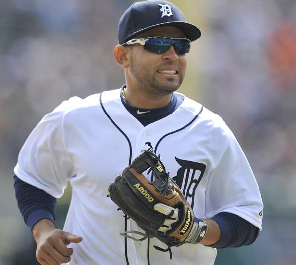
The big focus of last season’s trade with the Marlins was Anibal Sanchez, and rightfully so. He was the best player in the deal and had the biggest impact on the Tigers down the stretch. They re-signed him for a lot of money and before the injury, he was having a Cy Young type season. But the Tigers also got Omar Infante back from the Marlins, and Omar Infante has made one of the more interesting transformations in baseball since we last knew him as a Tiger.
Infante came to the major leagues very young, at age 20, and from 2002 to 2008 only played about one solid major league season. Here are his WAR totals for those seasons, understanding that his PA varied.
| Season | Team | PA | WAR |
| 2002 | Tigers | 75 | 0.6 |
| 2003 | Tigers | 244 | -0.5 |
| 2004 | Tigers | 556 | 1.7 |
| 2005 | Tigers | 434 | -0.1 |
| 2006 | Tigers | 245 | 0.7 |
| 2007 | Tigers | 178 | -0.2 |
| 2008 | Braves | 348 | 0.6 |
Infante had a reasonably good season in 2004 (2.0 WAR is generally considered starter level), but in every other season he either performed near replacement level or didn’t get enough at bats to provide much value because he wasn’t playing well. Omar looked poised for a career as a backup or up and down guy despite making it to the show so young. Then something funny happened. Here are his WAR numbers for 2009-2013:
| Season | Team | PA | WAR |
| 2009 | Braves | 229 | 1.1 |
| 2010 | Braves | 506 | 2.1 |
| 2011 | Marlins | 640 | 2.1 |
| 2012 | 2 Teams | 588 | 3 |
| 2013 | Tigers | 303 | 2.4 |
Infante went from borderline AAA player to solid major league regular. He peaked in 2004 in the first group and slowly lost playing time as his production dropped. But he rebuilt his value in 2009 as a backup and became a full on regular every year since and has added more than 2.0 WAR in each of the last four seasons. Here it is in graphical form, keep in mind that 2013 is only half over:

He’s becoming more and more valuable each season. That’s pretty clear and it’s not so crazy to see it given that he is essentially doing it during the peak years of baseball performance (27-31), but it is a big out of the ordinary how exactly Infante is doing it.
Let’s look at his offensive production over time using wRC+ which compares a player to a league average hitter (100). I’ve dropped out his first season because he only played about 20 games:

So Infante has become a better hitter, but he hasn’t really become that much better over the last few seasons compare to the previous ones. By 2008, he was locked into a 90-110 wRC+ pocket. That number has fluctuated but he also achieved it in 2004 and 2006. He’s become a more consistent offensive performer but he isn’t a great hitter and has had two below average seasons during his recent breakout. He’s a better hitter than he used to be, but that isn’t what’s really driving his transformation.
Infante has become a solid major leaguer over the last few seasons because he’s become a complete baseball player. The offense has stabilize, but it’s his glove and baserunning that have pushed him over the top. Check this out. Here are Infante’s defensive and baserunning numbers from his career. NOTE: I’ve dropped 2002 because of how few games he played and I have extrapolated his 2013 numbers so that you can see how much better he is playing this season. To be clear, the 2013 numbers are projections because these are not rate stats:

Infante has become a much better defender and a noticeably better baserunner over the last three seasons and it’s helping him become one of the more valuable second basemen in the game. He’s currently on pace for a 4-5 WAR season, and even if that won’t keep up completely, he looks poised to turn in his best season yet. He’s doing it with defense and baserunning which are parts of a player’s game that are supposed to peak early. You’re supposed to become a better hitter as time goes on and you’re supposed to watch your other skills fade early.
Infante won’t hear of that. He’s becoming a good all-around player as he ages, which is making him very valuable. Here are the runs above replacement from his defense and baserunnining added together over his career. Remember, 10 runs equals 1 WAR:

But here are his run values on offense:
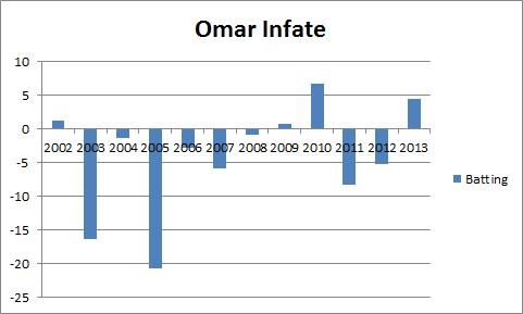
Yes his offense is getting better, but the value is coming from turning himself into a good defender and baserunner. Replacement level and positional adjustments are added to these to get WAR, but you can see clearly that Infante is taking an unusual path toward mid career success.
He’s getting better in the field and on the bases and it’s working for him and the Tigers.
A New Way To Measure Relief Pitchers: SOEFA
I’ve long been a critic of the save statistic, and I don’t need to rehash why it’s the scourge of the baseball world, but relief pitching is still an important part of the game and we often struggle to properly measure it. Won/Loss record and saves tell you nothing about a player’s individual skill, especially not relievers, and even things like ERA don’t do a lot of good because relievers aren’t charged for runners they let in belonging to another pitcher and can get charged with runs allowed by the pitchers who come after.
Strikeouts, walks, and homeruns allowed (the basis of FIP) are good measurements, but FIP inherently strips away context. And context does matter for relief pitchers. It’s an elite reliever’s job to come in and strand runners, so strikeouts are good and homeruns are bad, but sequencing is really important and it matters a lot when they get outs and when they allow baserunners.
In a sense, FIP and similar statistics are good, but they aren’t perfect because they’re context neutral and we might want some context in reliever stats. Win Probability Added (WPA) is a typical way to fix this, but this feels too context dependent for me. WAR is always a nice combination of these kinds of measures, but WAR is a counting stat so how much a reliever is used matters a lot, and relievers are often used incorrectly.
My point here is not that I can come up with something better, but rather that I want to try to add something. I always look at reliever stats and find logical holes more often than with position players and starters. I want a reliever stat that measures context, considers the peripheral numbers, and also understands the luck involved. I didn’t find one out there that satisfied me, so I went to work inventing one.
I’ll say this. This isn’t perfect and I want to improve it. Flaws you may find in the method should not cause you to discount it, but rather to add to the discussion. This is a first crack. I hope you find it useful.
The Goal
So first, I started with a question: What is the job of a relief pitcher? Here was my answer:
- Strand runners
- Don’t allow baserunners
- If you allow baserunners, don’t let them score.
With that outlined, I went to work thinking about how to measure each and came up with the following statistic that I will call SOEFA, pronounced like “sofa.” It stands for Strand On-base ERA FIP Average and should be thought of as a way to measure relievers from your sofa. Yes, I have a whimsical side.
It has four components, let’s walk through them.
The Formula
First is Strand Rate+, which I calculated as what percent better or worse a reliever is from league average at stranding runners. League average is 70%, so if you strand 100% of your inherited runners, your Strand Rate+ is .43 because you are 43% better than league average.
Second, is your Expected OBP+ or xOBP+ which is your opponents on base percentage calculated as a percentage deviation from league average just like SR+, except that I regress your hits allowed based on league average BABIP because sometimes batters get lucky hits.
Third, is my version or ERA+, which is just like normal ERA- except I scale mine to zero instead of 100 like the major stat sites and invert it. Same principles regarding deviation from average applies. FIP+ is exactly the same, except I use FIP-. These numbers are park adjusted.
To combine them, I add SR+ to xOBP+ and then add ERA+ to get eSOEFA. I then repeat the same process and replace ERA+ with FIP+ to get fSOEFA. A pitcher’s SOEFA score is the average between the two.
The output gives you a number that sets league average at zero and ranges technically from negative infinity to about 2.5, but generally speaking you won’t see a reliever fall below -2.5. Basically it’s a -3 to 3 scale that puts good relievers on the plus side and bad ones on the negative side.
Additionally, at my discretion, relievers who have inherited fewer than five baserunners during the season (this number will likely be fluid based on where we are in the season) are given a league average SR+ so that if you don’t ever inherit runners you aren’t unfairly punished because you are not given sufficient opportunity to strand them or you are not given credit for an awesome strand rate if you strand the only runner you inherit.
I’m pretty happy with the first round of results. The first run of results came from stats entering June 25th and it generally lines up with my impression of the best performing relief pitchers in baseball. I have no idea if this stat is predictive or how long it takes to stabilize. Right now, it correlates with ERA and FIP at -.73 and -.75 despite the fact that each is only 1/6 of the input and the R squared is around .6 using it to predict FIP, if those kinds of things interest you.
It’s experimental. It’s meant to be fun and maybe helpful.
A word of note is that Fangraphs and B-R seem to use different cutoffs for which relievers “qualify,” so this output may be missing a few relievers. I’m sorry about that. The great thing about this statistic is that I can easily produce the number for any reliever in baseball in less than two minutes. If you want to know how a reliever measures up or how a reliever did during a given season, just ask and I can provide the number based on a handy program I wrote. Hit me on Twitter @NeilWeinberg44 and I’d be happy to provide the SOEFA for any reliever.
Thanks for reading and I welcome any feedback. Who knows, maybe this will work.
Below are the SOEFA for the vast majority of qualifying relievers up through 6/24/13. If you want to know the SOEFA of a reliever not on this list or would like an update score, please let me know.
| Rank | Player | Team | SOEFA |
| 1 | Sergio Romo | Giants | 0.99 |
| 2 | Jason Grilli | Pirates | 0.95 |
| 3 | Junichi Tazawa | Red Sox | 0.92 |
| 4 | Kevin Gregg | Cubs | 0.92 |
| 5 | Drew Smyly | Tigers | 0.9 |
| 6 | Joaquin Benoit | Tigers | 0.89 |
| 7 | Jordan Walden | Braves | 0.88 |
| 8 | Robbie Ross | Rangers | 0.87 |
| 9 | Mark Melancon | Pirates | 0.85 |
| 10 | Jesse Crain | White Sox | 0.83 |
| 11 | Edward Mujica | Cardinals | 0.79 |
| 12 | Brett Cecil | Blue Jays | 0.79 |
| 13 | Greg Holland | Royals | 0.75 |
| 14 | Oliver Perez | Mariners | 0.74 |
| 15 | Trevor Rosenthal | Cardinals | 0.74 |
| 16 | Kenley Jansen | Dodgers | 0.72 |
| 17 | Glen Perkins | Twins | 0.71 |
| 18 | Koji Uehara | Red Sox | 0.7 |
| 19 | Preston Claiborne | Yankees | 0.69 |
| 20 | Sam LeCure | Reds | 0.68 |
| 21 | Casey Janssen | Blue Jays | 0.64 |
| 22 | Mariano Rivera | Yankees | 0.63 |
| 23 | Luke Gregerson | Padres | 0.62 |
| 24 | Craig Kimbrel | Braves | 0.62 |
| 25 | Sean Doolittle | Athletics | 0.6 |
| 26 | Edgmer Escalona | Rockies | 0.56 |
| 27 | Tommy Hunter | Orioles | 0.56 |
| 28 | Brad Ziegler | Diamondbacks | 0.54 |
| 29 | Joe Nathan | Rangers | 0.53 |
| 30 | Joe Smith | Indians | 0.53 |
| 31 | Vin Mazzaro | Pirates | 0.51 |
| 32 | Jim Henderson | Brewers | 0.5 |
| 33 | James Russell | Cubs | 0.49 |
| 34 | Casey Fien | Twins | 0.48 |
| 35 | Tim Collins | Royals | 0.47 |
| 36 | Shawn Kelley | Yankees | 0.47 |
| 37 | Brian Matusz | Orioles | 0.46 |
| 38 | Addison Reed | White Sox | 0.46 |
| 39 | Tanner Scheppers | Rangers | 0.45 |
| 40 | Rafael Soriano | Nationals | 0.44 |
| 41 | Aroldis Chapman | Reds | 0.44 |
| 42 | Joel Peralta | Rays | 0.43 |
| 43 | Matt Reynolds | Diamondbacks | 0.43 |
| 44 | Brandon Kintzler | Brewers | 0.43 |
| 45 | Ryan Cook | Athletics | 0.42 |
| 46 | Chad Qualls | Marlins | 0.42 |
| 47 | Cody Allen | Indians | 0.4 |
| 48 | Andrew Miller | Red Sox | 0.4 |
| 49 | David Robertson | Yankees | 0.38 |
| 50 | Seth Maness | Cardinals | 0.36 |
| 51 | Bobby Parnell | Mets | 0.36 |
| 52 | Matt Belisle | Rockies | 0.36 |
| 53 | Josh Outman | Rockies | 0.36 |
| 54 | Rex Brothers | Rockies | 0.35 |
| 55 | Jonathan Papelbon | Phillies | 0.35 |
| 56 | Dale Thayer | Padres | 0.35 |
| 57 | Darren O’Day | Orioles | 0.33 |
| 58 | Justin Wilson | Pirates | 0.33 |
| 59 | Luke Hochevar | Royals | 0.31 |
| 60 | Grant Balfour | Athletics | 0.3 |
| 61 | John Axford | Brewers | 0.29 |
| 62 | Ernesto Frieri | Angels | 0.29 |
| 63 | Drew Storen | Nationals | 0.27 |
| 64 | Bryan Shaw | Indians | 0.26 |
| 65 | Nate Jones | White Sox | 0.26 |
| 66 | Luis Avilan | Braves | 0.25 |
| 67 | Anthony Varvaro | Braves | 0.25 |
| 68 | Anthony Swarzak | Twins | 0.24 |
| 69 | Paco Rodriguez | Dodgers | 0.24 |
| 70 | Jean Machi | Giants | 0.2 |
| 71 | Tyler Clippard | Nationals | 0.19 |
| 72 | Matt Thornton | White Sox | 0.19 |
| 73 | Steve Delabar | Blue Jays | 0.18 |
| 74 | Craig Stammen | Nationals | 0.17 |
| 75 | Tony Watson | Pirates | 0.17 |
| 76 | Pat Neshek | Athletics | 0.16 |
| 77 | Jamey Wright | Rays | 0.16 |
| 78 | J.P. Howell | Dodgers | 0.16 |
| 79 | Cesar Ramos | Rays | 0.15 |
| 80 | Alfredo Simon | Reds | 0.15 |
| 81 | Troy Patton | Orioles | 0.15 |
| 82 | Matt Lindstrom | White Sox | 0.14 |
| 83 | Jim Johnson | Orioles | 0.12 |
| 84 | Carter Capps | Mariners | 0.11 |
| 85 | Ryan Pressly | Twins | 0.11 |
| 86 | Steve Cishek | Marlins | 0.11 |
| 87 | Darin Downs | Tigers | 0.1 |
| 88 | Antonio Bastardo | Phillies | 0.09 |
| 89 | Charlie Furbush | Mariners | 0.07 |
| 90 | Brian Duensing | Twins | 0.07 |
| 91 | Yoervis Medina | Mariners | 0.07 |
| 92 | Jerry Blevins | Athletics | 0.07 |
| 93 | Tom Gorzelanny | Brewers | 0.06 |
| 94 | Jared Burton | Twins | 0.05 |
| 95 | Jose Veras | Astros | 0.05 |
| 96 | Joe Kelly | Cardinals | 0.05 |
| 97 | David Hernandez | Diamondbacks | 0.04 |
| 98 | Ryan Webb | Marlins | 0.04 |
| 99 | Aaron Loup | Blue Jays | 0.03 |
| 100 | Wesley Wright | Astros | 0.01 |
| 101 | Bryan Morris | Pirates | 0.01 |
| 102 | Burke Badenhop | Brewers | 0 |
| 103 | Dane de la Rosa | Angels | -0.02 |
| 104 | Adam Ottavino | Rockies | -0.04 |
| 105 | LaTroy Hawkins | Mets | -0.04 |
| 106 | Cory Gearrin | Braves | -0.06 |
| 107 | Joe Ortiz | Rangers | -0.08 |
| 108 | Wilton Lopez | Rockies | -0.08 |
| 109 | Brandon Lyon | Mets | -0.08 |
| 110 | J.J. Hoover | Reds | -0.08 |
| 111 | Mike Dunn | Marlins | -0.09 |
| 112 | Fernando Rodney | Rays | -0.1 |
| 113 | Hector Ambriz | Astros | -0.1 |
| 114 | Paul Clemens | Astros | -0.13 |
| 115 | Tom Wilhelmsen | Mariners | -0.13 |
| 116 | Matt Guerrier | Dodgers | -0.13 |
| 117 | Josh Roenicke | Twins | -0.17 |
| 118 | Jose Mijares | Giants | -0.21 |
| 119 | Michael Gonzalez | Brewers | -0.23 |
| 120 | Jonathan Broxton | Reds | -0.25 |
| 121 | Jake McGee | Rays | -0.25 |
| 122 | Matt Albers | Indians | -0.26 |
| 123 | A.J. Ramos | Marlins | -0.26 |
| 124 | Scott Rice | Mets | -0.29 |
| 125 | Nick Hagadone | Indians | -0.31 |
| 126 | Travis Blackley | Astros | -0.33 |
| 127 | Vinnie Pestano | Indians | -0.34 |
| 128 | George Kontos | Giants | -0.35 |
| 129 | Mike Adams | Phillies | -0.39 |
| 130 | Clayton Mortensen | Red Sox | -0.4 |
| 131 | Garrett Richards | Angels | -0.43 |
| 132 | Heath Bell | Diamondbacks | -0.46 |
| 133 | Esmil Rogers | Blue Jays | -0.5 |
| 134 | Ronald Belisario | Dodgers | -0.51 |
| 135 | Jeremy Affeldt | Giants | -0.55 |
| 136 | Brandon League | Dodgers | -0.55 |
| 137 | Jeremy Horst | Phillies | -0.58 |
| 138 | Kelvin Herrera | Royals | -0.67 |
| 139 | Carlos Marmol | Cubs | -0.72 |
| 140 | Huston Street | Padres | -0.82 |
| 141 | Anthony Bass | Padres | -0.94 |
| 142 | Hector Rondon | Cubs | -1.24 |
Stat of the Week: Weighted Runs Above Average (wRAA)
When we talk about offensive statistics, the ones we usually talk about on New English D are wOBA and wRC+ which take the actual value of each offensive action and weight them properly, which OBP and SLG do not do. I encourage you to clink the links and read about those statistics if you have not already done so. However, those two statistics are rate stats and not counting stats. Rate stats tell you how well a player has performed while they’ve been on the field, but counting stats are also good for telling you how much value a player has actually added to his team.
If you have a 150 wRC+, but only have half the plate appearances of someone with a 120 wRC+, you’re not as valuable. You need to be both a good performer and a player who stays healthy and on the field. With that, I’ll introduce Weighted Runs Above Average (wRAA) to do just that. Weighted Runs Created (notice the absence of the plus sign) is a similar statistic, but it is just scaled differently. The concept is the same, but let’s stick with wRAA.
wRAA is the offensive component of Wins Above Replacement (WAR) and is based on wOBA and is rather simple to calculate if you have all of the necessary numbers.
((wOBA – League Average wOBA)/wOBA scale) * (PA)
A player’s wOBA and PA are pretty obvious and the league average and wOBA scale be found for each season quite easily here. The idea behind this statistic is how many runs a player is worth to his team above average and ten runs is equivalent to one WAR. Here is the full explanation from Fangraphs but the idea is pretty simple. How many runs above average has a player been worth to his team. Average, therefore, is 0 and anything above 10 is good and above 20 is great. It is also a counting stat, so players accumulate them throughout the season as opposed to wRC+ and wOBA which are rate stats.
I generally like rate stats better, but counting stats are an important comparison. Here’s a quick example:
Miguel Cabrera has a 193 wRC+ and .456 wOBA in 325 PA while Matt Tuiasosopo has a 186 wRC+ and .446 wOBA in 88 PA. Cabrera and Tuiasosopo have very similar rate stats, but you can distinguish their value based on how many PA they have using wRAA. Cabrera has 36.9 and Tuiasosopo has 9.3.
I wouldn’t tell you to use wRAA over wRC+ or wOBA, but it is nice to use in tandem if you’re trying to compare which players have been more valuable to their team, but stick with the rate stats if you care about determining who is actually the better player.
The Nine Worst Seasons by “Closers”
At New English D we do not approve of the way modern bullpens are managed. We don’t appreciate the way managers chase “saves” and only go to proven closers in perfectly aligned save situations. We believe this to be an inefficient and illogical use of resources. If you’d like to catch up on the theory behind these views, here are three pieces we’ve publish this year on the subject that tell a pretty complete story:
But for now, as an exercise in the ridiculousness of closers and an exercise in fun baseball history, I present to you, The Nine Worst Seasons by Closers.
The rules are simple. Since “Saves” became an official statistic in 1969, there have been 5088 individual qualifying reliever seasons and among those there have been 557 relievers to get 30 or more save opportunities in a given season. Full disclosure, “Blown Saves” are not recorded in the first few years of the sample, so it’s possible I’m missing a few relievers who had 30 save opportunities because I added saves and blown saves to get save opps. The rankings below are determined by Fielding Independent Pitching (FIP) because I believe that to be the best measure of pitcher performance because it takes into account strikeouts, walks, and homeruns without punishing anyone for bad defense or rewarding anyone who allows inherited runners to score. xFIP isn’t available for all of the years in question and WAR is a counting stat, so it would be misleading when comparing pitchers who threw a considerably different number of innings. (FYI: The average number of blown saves among pitchers who had at least 30 SVO in a season is 6. The average SV% in the sample is 85%.) You can find full stats for the relievers below here (Worst Closers).
9. Bobby Thigpen (1991 White Sox)
30 for 39 in SVO, 3.49 ERA, 5.18 FIP
8. Jorge Julio (2003 Orioles)
36 for 44 in SVO, 4.38 ERA, 5.20 FIP
7. Rocky Biddle (2003 Expos)
34 for 41 in SVO, 4.65 ERA, 5.26 FIP
6. Brad Lidge (2009 Phillies)
31 for 42 in SVO, 7.21 ERA, 5.45 FIP
5. Jeff Montgomery (1996 Royals)
24 for 34 in SVO, 4.26 ERA, 5.67 FIP
4. Jason Isringhausen (2006 Cardinals won World Series)
33 for 43 in SVO, 3.55 ERA, 5.70 FIP
3. Ambiorix Burgos (2006 Royals)
18 for 30 in SVO, 5.60 ERA, 5.89 FIP
2. Jose Mesa (1999 Mariners)
33 for 38 in SVO, 4.98 ERA, 5.92 FIP
1. Shawn Chacon (2004 Rockies)
35 for 44 in SVO, 7.11 ERA, 6.57 FIP
I’m fully aware that a list of the worst people to ever do something doesn’t prove much, but it’s interesting nonetheless. Seven of the nine worst closers in baseball history got 30 saves during their worst season. That has to tell you something about how easy it is to accumulate saves.
Also of note: The worst closer on this list who only blew one save is Fernando Rodney of the 2009 Tigers. He was 37/38 despite a 4.40 ERA and 4.56 FIP. Ah, the good old days.
Stat of the Week: Run Expectancy
A point of contention among members of the baseball community is bunting. Most sabermetricians would tell you that the sacrifice bunt is overused because it gives away an out while a lot of on-field Dusty Baker/Harold Reynolds type people love bunting to move runners closer to the plate. I’m not here to argue for or against bunting, but rather to offer you a tool for determining the answer for yourself. This tool is a Run Expectancy Matrix.
The idea behind Run Expectancy is figuring out how many runs, on average, a team scores in a given situation (based on the number of outs and which bases are occupied). The values are based on long run averages and you can calculate them based on many years or a single year, but the ratios are generally going to be the same. Presented below is the matrix from 2012. What you see in the grid is the expected number of runs a team will score given the situation as presented by the top row and left column. You can use the RE Matrix to determine which strategic move is best for you.

So let’s use an example. Runner on 1st base, no outs. At this point, the team is expected to score .8577 runs this inning because, on average, teams have scored that many runs in the inning after those situations have occurred. If we were to sacrifice bunt in this situation, we would move to runner on 2nd, 1 out, which has an expected run value of .6551. That’s obviously less than .8577, so the sacrifice bunt in that situation is not the right play on average. You can play around with other situations on your own.
An important caveat is that this chart is context neutral and reflects averages. If the baserunner is Austin Jackson and the guy bunting is Miguel Cabrera, you’re hurting yourself more than if the runner is Victor Martinez and the bunter is Ramon Santiago. You should be more willing to give up an out to move a runner if the batter is more likely to make an out. However, that doesn’t mean it’s necessarily ever the right play to give up the out. A pitcher who hits .150 is almost definitely going to make an out, so you want him to move the runner up, but Miguel Cabrera is pretty likely going to get a hit relative to average, so you don’t want him intentionally making an out.
I don’t mean to suggest that you should take these numbers as gospel, but rather that you should be aware of which situations lead to the most runs and which situations you want to get yourself into if possible. The takeaway here is that we know how many runs a team is likely to score in a given situation and we can make some sort of educated prediction about what will happen if we do something else. Context matters, but this matters too.
I’m generally not a fan of the sacrifice bunt (or conversely the intentional walk), but there are occasional situations in which it makes sense. This RE Matrix should help you better understand which situations call for which moves.
As always, if you have questions about how this works or how to use it, feel free to comment or contact us. Also, please let us know if there is a statistic or sabermetric concept you’d like to learn about and we’d be happy to cover it.
Stat of the Week: Expected Fielding Independent Pitching (xFIP)
Generally, I’ve been a little light on “weekly” updates to this feature, but I generally write at least one statistically informative post a week, even if it doesn’t actually follow the mold I’ve laid out. Today, I’ll try to write that wrong with an introduction to the very useful Expected Fielding Independent Pitching (xFIP).
You may recall my introduction to Fielding Independent Pitching (FIP) some months ago and my frequent use of the metric on the site. You can read my introduction to FIP or Fangraphs’ primer to catch up, but I’ll outline the basic concept because it carries over.
We use FIP because ERA is not a reflection of a pitcher’s individual performance because he cannot control what his defense does once the ball is put in play. Two pitchers who are carbon copies of each other will perform differently if you put them in front of the Dbacks defense (currently the league’s best) and the Angels defense (one of the league’s worst so far) despite throwing identical pitches to identical hitters. ERA is a reflection of the team as a whole, not just the pitcher.
In steps FIP or a class of numbers coming from this idea, to measure a pitcher’s performance based only on what we know he can control. FIP takes strikeouts, walks, and homeruns and uses historic run values to calculate a number on the same scale as ERA so that you can see which pitchers are succeeding in the areas of the game they can control. Generally speaking, defense evens out over a long enough period and ERA, FIP, and our new friend xFIP will converge toward each other.
The FIP formula looks like this:
FIP = ((13*HR)+(3*(BB+HBP))-(2*K))/IP + constant
So what exactly is xFIP? xFIP, as you can read about on Fangraphs, takes this one more step. xFIP is the same as FIP except it normalizes HR/FB rate to give you a number that better predicts future performance.
It’s actually pretty simple, just stay with me. Generally speaking, we’ve found that the percentage of a pitcher’s flyballs that are hit for homeruns will converge toward about 10% and that large variations from that number are not sustainable. If you allow more flyballs, you’ll allow more homeruns, and that will cost you in FIP and xFIP, but if you’re allowing half of your flyballs to go for homeruns, it’s likely that won’t happen for very long.
So xFIP looks like this:
xFIP = ((13*(Flyballs * League-average HR/FB rate))+(3*(BB+HBP))-(2*K))/IP + constant
As you can see, it’s the same formula, but it takes your flyball rate and multiplies that by the league average HR/FB rate to get a more predictive version of your HR rate going forward. xFIP is one of the best indicators of future performance we have and it is very useful in evaluating which pitchers are getting lucky and which pitcher’s are actually performing in line with their skills.
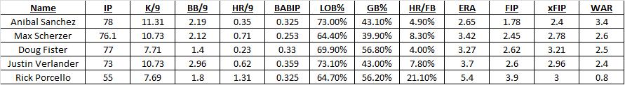
If we scan the Tigers 2013 leaderboard right now (digits truncated), you can get a sense of how this works. As expected, all of the Tigers have better FIP than their ERA because they play in front of a poor defense, but all of their xFIP are slightly higher than their FIP (except for Porcello) because they are allowing a lower than average HR/FB rate. Porcello, on the other hand, has very unlucky 21% HR/FB rate, so his xFIP is better than his FIP. Again, xFIP correlates better with future performance than almost any other ERA estimator.
Personally, I like to look at FIP to see how a pitcher is doing and use xFIP to see how fluke-y his homerun rate is. They’re both good metrics and they are both better indicators of individual performance than ERA.
Want to learn about a statistic? Request one for the next edition in the comments section or on Twitter @NeilWeinberg44. If you’re looking to catch up on sabermetrics, check out New English D’s posts on FIP, WAR, wOBA, wRC+, and ISO.
On Defense and Unearned Runs: ERA Isn’t the Answer
Last night, Justin Verlander was not at his best, but his overall line looked worse than it was because Torii Hunter made two poor plays in right that cost Verlander two runs, but neither was ruled an error. So Verlander’s ERA goes up because of poor defense even though conventional wisdom is that the “earned” part of ERA factors out your defense making mistakes behind you.
It does and it doesn’t. You don’t get charged for runs that come from errors but you do get penalized when the official scorer makes a mistake (as we saw last night) and when your defensive players do not make a play they should have even though it does not qualify as an error. Sabermetricians have devised other metrics like FIP, xFIP, SIERA, and others to stand in for ERA with a focus on elements of the game that pitchers can control because they have no control of what happens once contact is made. (Read my explanation of FIP for more specific information)
Today, I’d like to offer a little concrete evidence for why ERA doesn’t capture a pitcher’s value. Let’s take an independent measure of defense (Fangraph’s aggregate Fld score) and compare it to the number of unearned runs a team allows (or the percentage of a team’s runs that are unearned).
I haven’t looked back into history, but for 2013 the relationship is nonexistent. For the raw number of unearned runs, the results are not statistically significant and are substantively small. On average a team needs to increase its Fld score (range -21 to 18 so far) by about 7 to eliminate a single unearned run on average (range 5 to 25 so far). On average, from worst to first in Fld you can move only 20% of the range of unearned runs. This tells us that the strength of one’s defense does not predict the number of unearned runs allowed. The results are the same if we control for the total number of runs a team has allowed.
Here it is in graphical form:

As you can see, the number of unearned runs has almost no relationship with Fld and if you squint hard enough can only come up with the slightest negative tilt. Basically, what this is showing you is that the difference between your runs allowed and the runs you get shoved into your ERA do not depend on the quality of your defense, it depends on the official scorer and it depends on a lot of other things that have nothing to do with a pitcher’s skill or performance.
This is all by way of saying that ERA is not a good measure of a pitcher’s true skill level. It’s not a bad place to start, but if you look at the Won-Loss Record and ERA, you’re getting very little useful information. Expand your horizon to K/9, BB/9, HR/FB, FIP, xFIP, and other statistics and metrics that enrich the game.
ERA attempts to capture the pitcher’s performance in isolation but it doesn’t. The defense and the official scorer play huge roles in determining that number. If you want to judge a pitcher by themselves, you need to look deeper.
If you’re interested in learning more, I encourage you to visit the Fangraphs Glossary or to post questions in the comment section. I’d be happy to explain or interpret any and all statistics about which you are curious.
